







Repos synced
2.1k
Library
407 components — 40 free and MIT licensed, 367 on the subscription.
Across 406 lines. Every version installs on its own — pick the one you want.
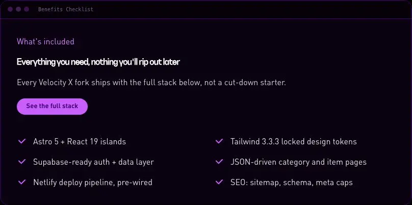
velocityx add <slug>Copy column paired with a one or two column checklist of benefits.
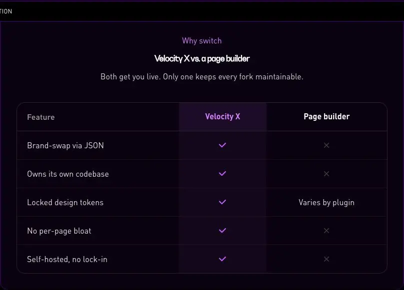
velocityx add benefits-checklist astro v1.0.0 Accessible comparison table with a highlighted column and horizontal scroll on mobile.
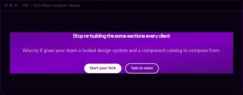
velocityx add comparison-table-section astro v1.0.0 Full-bleed brand-gradient CTA banner, the project's single-use-per-page gradient moment.
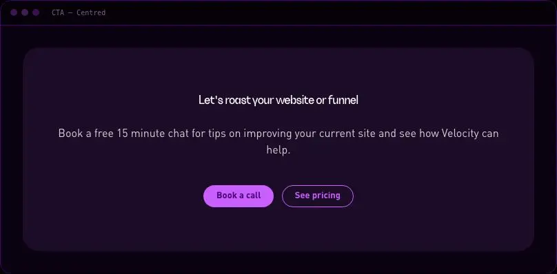
velocityx add cta-banner-gradient astro v1.0.0 Centred call-to-action card with one or two buttons.
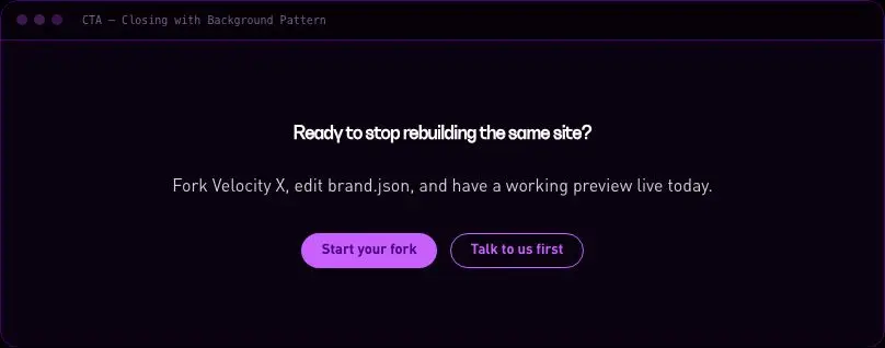
velocityx add cta-centred astro v1.0.0 Final-page CTA with a subtle CSS dot-grid pattern masked behind the copy.
velocityx add cta-closing-pattern astro v1.0.0 Bordered two-column section pairing a pitch with an inline newsletter signup form.
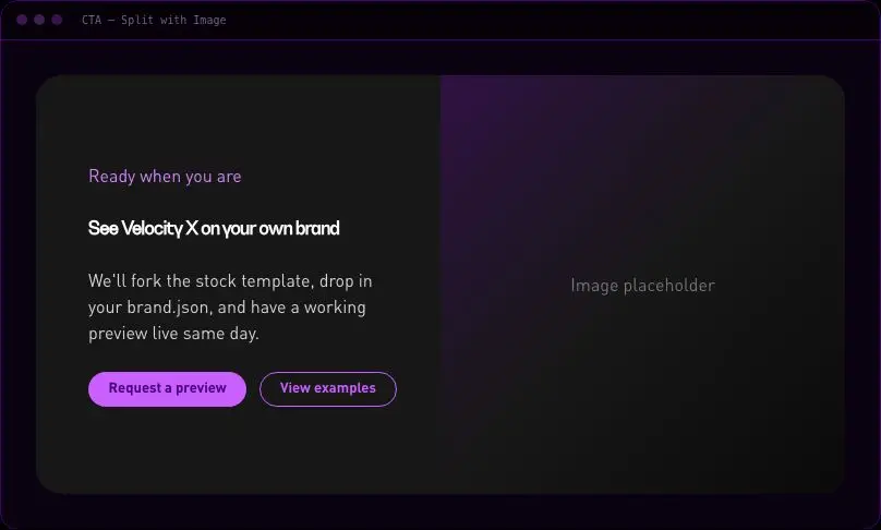
velocityx add cta-newsletter-section astro v1.0.0 Rounded CTA card with copy on one side and an image or placeholder on the other.
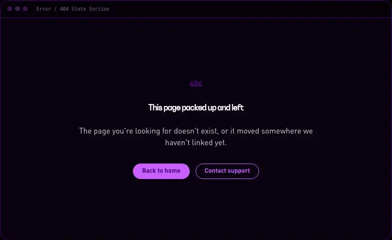
velocityx add cta-split-image astro v1.0.0 Centred full-page error state with a large code, message and primary/secondary actions.
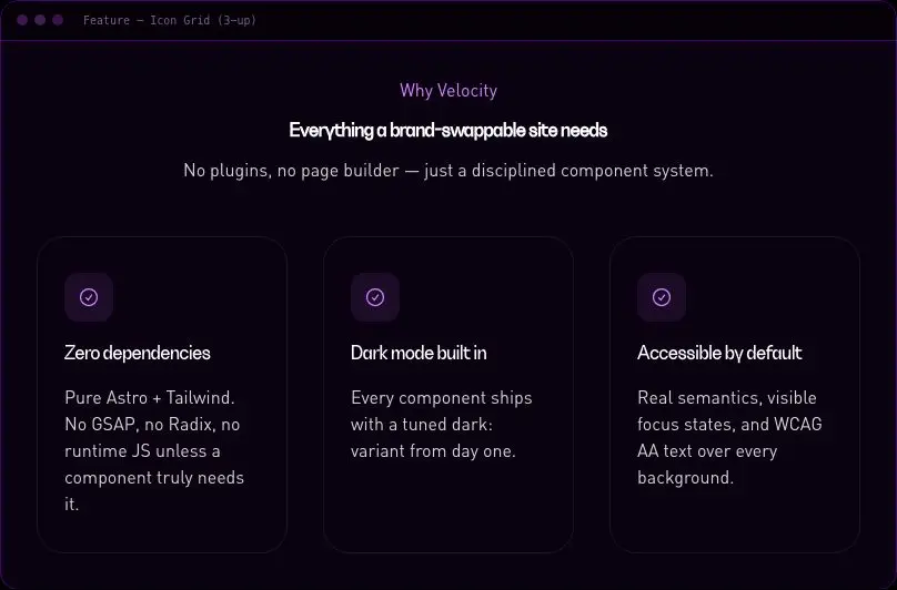
velocityx add error-state-section astro v1.0.0 Responsive 3-up icon, title and description feature grid with a BYO-SVG icon slot.
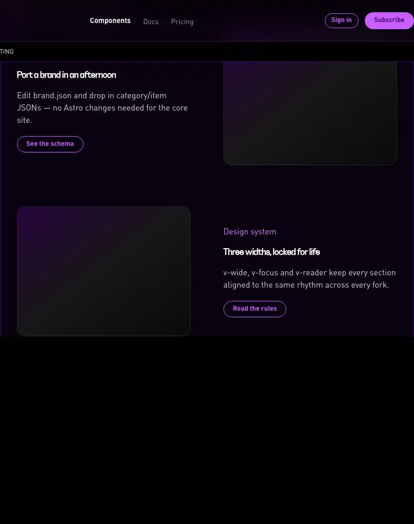
velocityx add feature-icon-grid astro v1.0.0 Stack of copy/image feature rows that alternate sides per row.
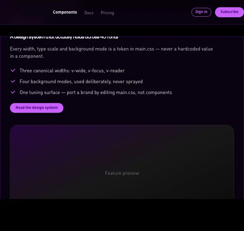
velocityx add feature-rows-alternating astro v1.0.0 Flagship single-feature section with heading, bullet list, CTA and a large visual.
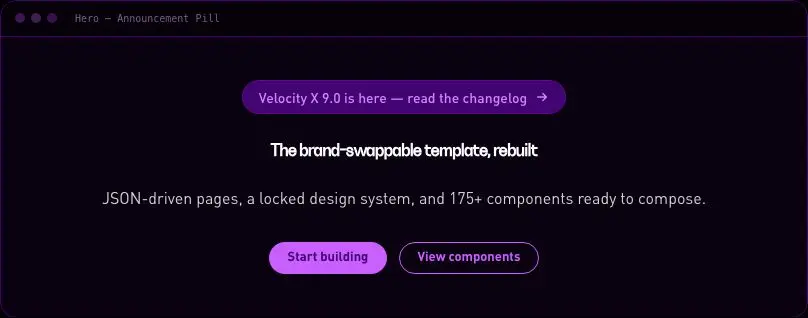
velocityx add feature-single-large astro v1.0.0 Centred hero with a linked pill announcement above the headline.
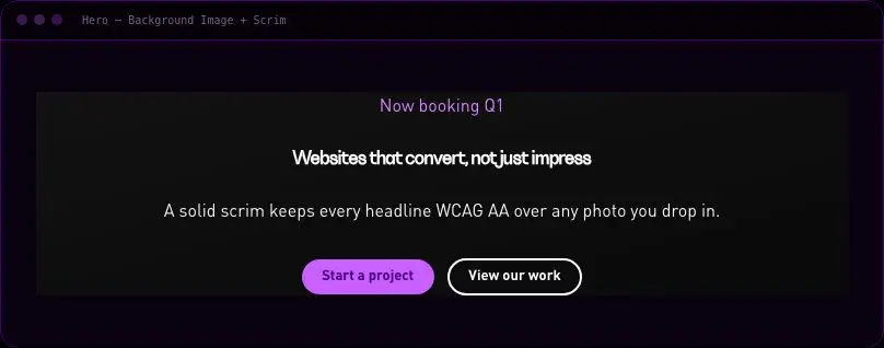
velocityx add hero-announcement-pill astro v1.0.0 Full-bleed background image hero with a solid WCAG-AA scrim behind the copy.
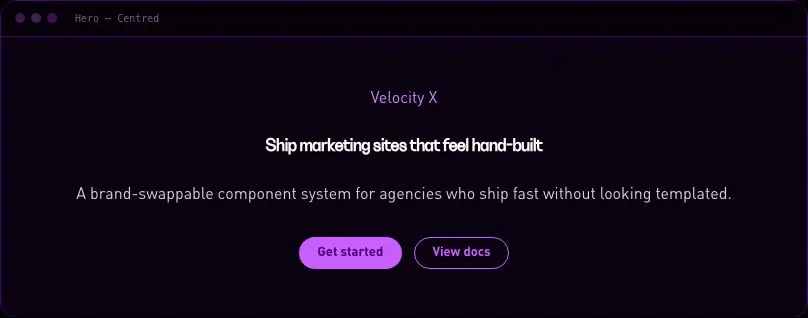
velocityx add hero-background-scrim astro v1.0.0 Centred eyebrow/headline/sub hero with two optional CTAs.
velocityx add hero-centred astro v1.0.0 Product hero with a CSS-only browser or phone frame wrapping the screenshot.
velocityx add hero-device-frame astro v1.0.0 Centred hero with an inline plain-HTML email capture form wired to any form action.
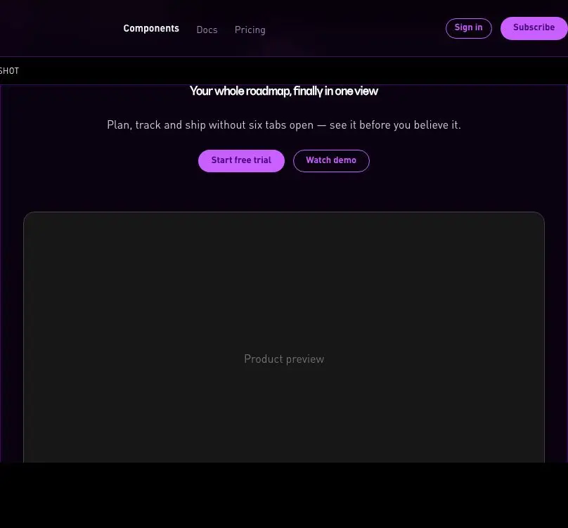
velocityx add hero-email-capture astro v1.0.0 Centred hero with a large product screenshot card floating below the fold with a soft glow.
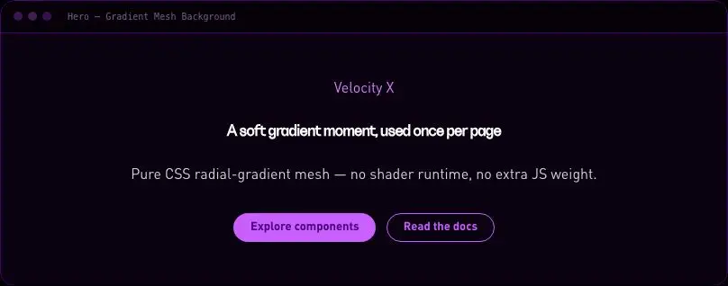
velocityx add hero-floating-screenshot astro v1.0.0 Centred hero with a pure-CSS radial gradient mesh backdrop, no shader runtime.
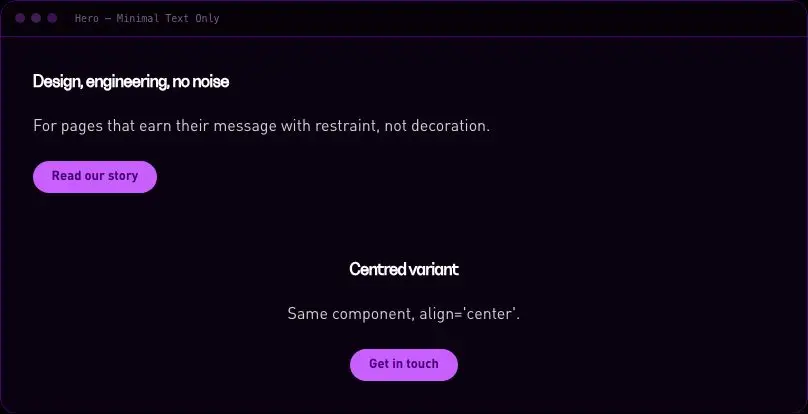
velocityx add hero-gradient-mesh astro v1.0.0 Undecorated headline/sub/CTA hero for editorial or brand pages.
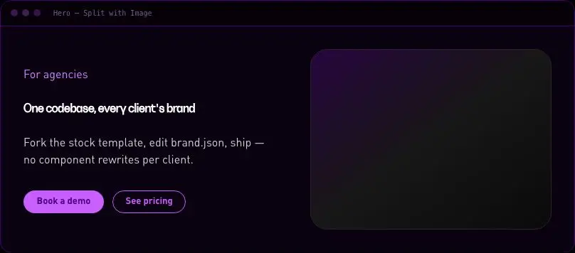
velocityx add hero-minimal-text astro v1.0.0 Copy-left image-right hero with a gradient placeholder fallback when no image is supplied.
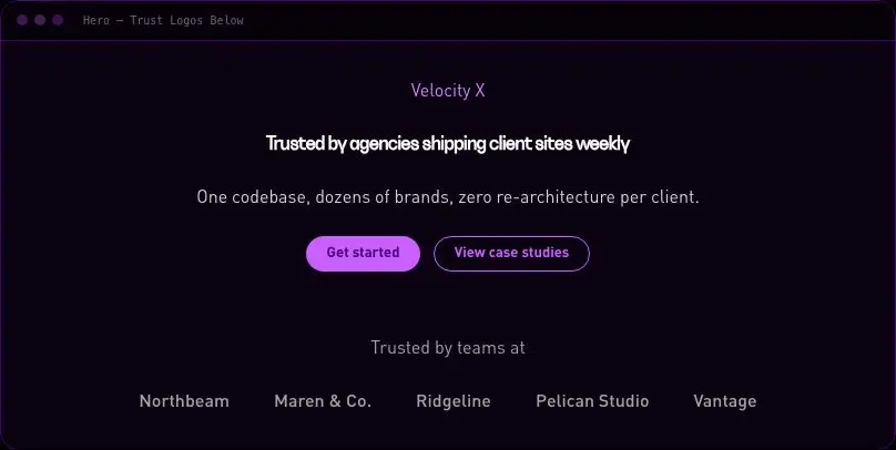
velocityx add hero-split-image astro v1.0.0 Centred hero with a grayscale-to-colour partner logo strip beneath the fold.
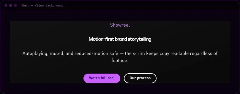
velocityx add hero-trust-logos astro v1.0.0 Full-bleed autoplaying muted video hero with a solid scrim and reduced-motion fallback to the poster frame.
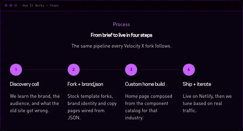
velocityx add hero-video-background astro v1.0.0 Numbered step sequence with a connecting line on desktop, stacked on mobile.
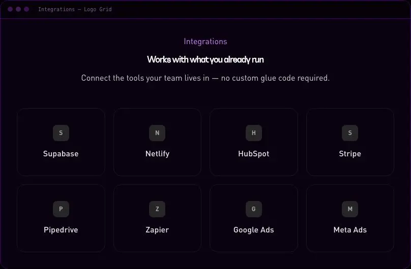
velocityx add how-it-works-steps astro v1.0.0 Grid of linkable integration/partner logo cards.
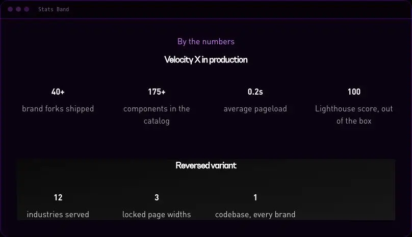
velocityx add integrations-logo-grid astro v1.0.0 Horizontal band of big numbers with labels, with a reversed dark-panel variant.
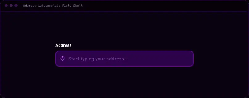
velocityx add stats-band astro v1.0.0 Debounced address-search UI shell with keyboard-navigable suggestions dropdown; geocoding is supplied by the host via props.
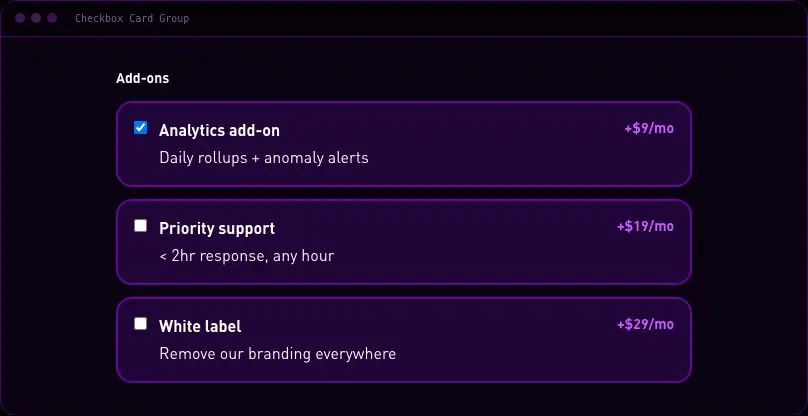
velocityx add address-autocomplete-field react v1.0.0 Multi-select add-on cards with the radio-card visual language but native checkbox semantics, zero JS.
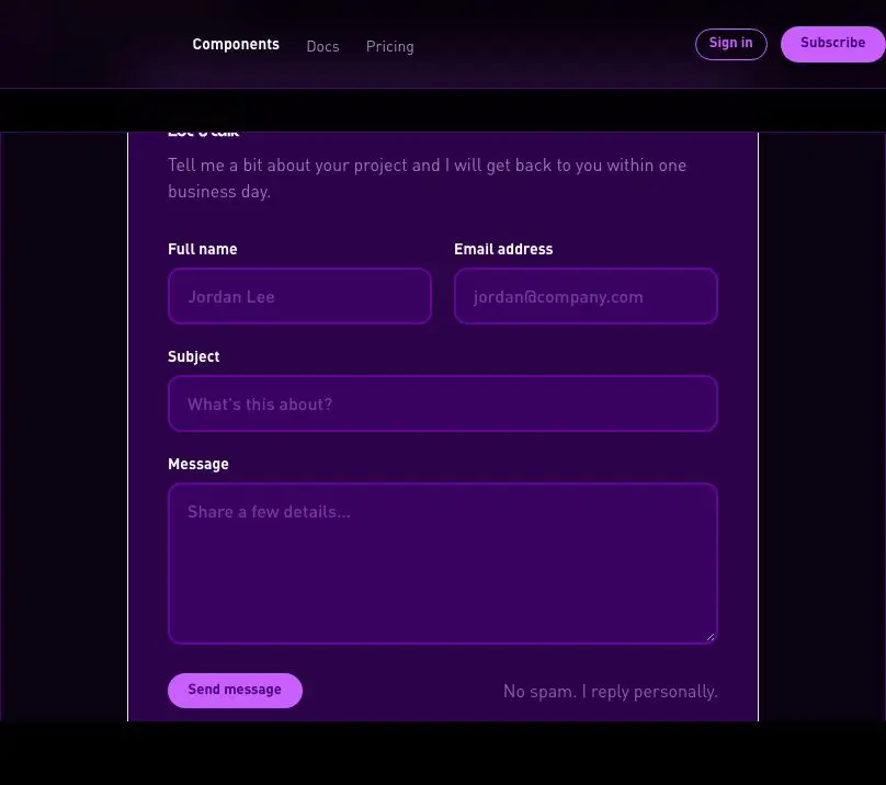
velocityx add checkbox-card-group astro v1.0.0 Single-column name/email/subject/message contact form with a honeypot field, Netlify Forms opt-in, and a presentational action prop.
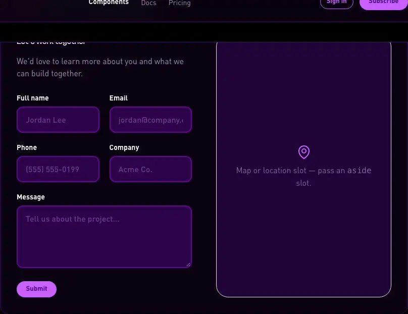
velocityx add contact-form-simple astro v1.0.0 Two-column contact layout with a named aside slot for a map or office photo, stacking to one column on mobile.
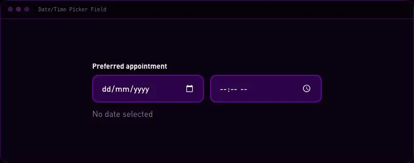
velocityx add contact-form-split astro v1.0.0 Styled native date and time input pair with a combined human-readable preview and a clear action.
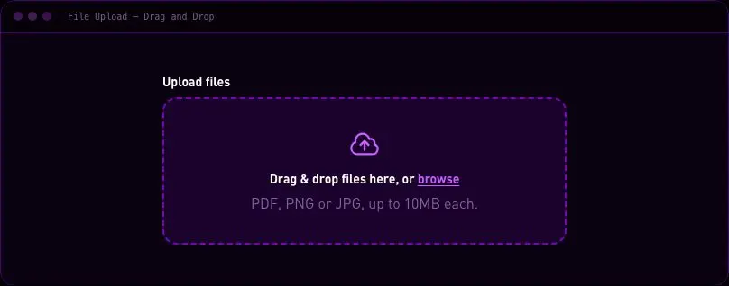
velocityx add datetime-picker-field react v1.0.0 Drag-and-drop file picker with browse fallback, size validation, and a removable selected-files list.
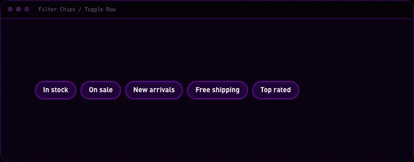
velocityx add file-upload-dropzone react v1.0.0 Horizontal row of togglable multi-select filter chips with an active count and clear-all action.
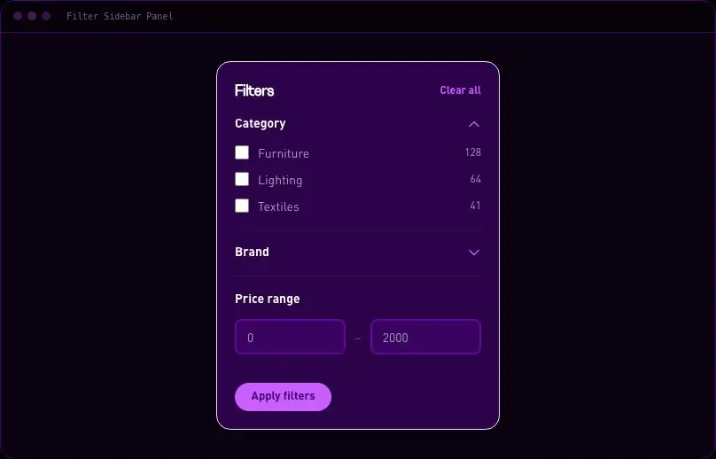
velocityx add filter-chips-row react v1.0.0 Vertical catalog filter stack with collapsible checkbox groups and a price range, built on native details elements.
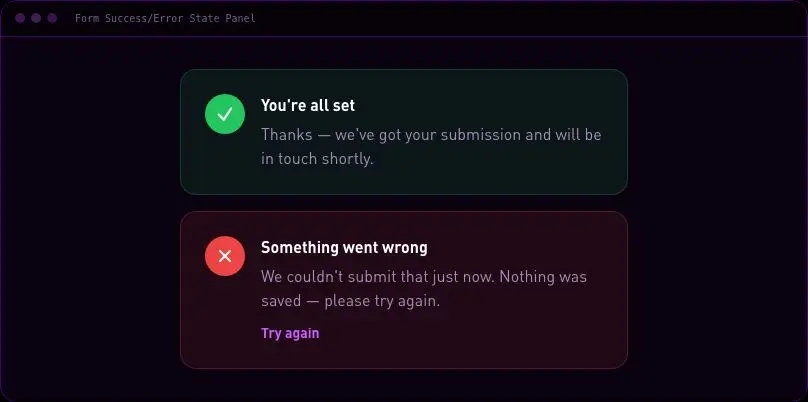
velocityx add filter-sidebar-panel astro v1.0.0 Post-submit status panel with success, error, and pending states for the host to swap in after a submission resolves.
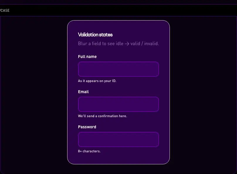
velocityx add form-success-error-panel astro v1.0.0 Reference demo of idle/valid/invalid inline field validation with live icons and messaging on blur.
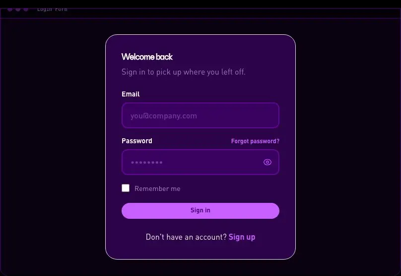
velocityx add inline-validation-showcase react v1.0.0 Email/password sign-in card with a show/hide password toggle driven by a scoped inline script.
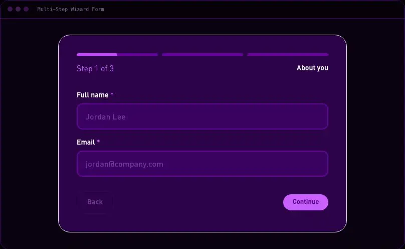
velocityx add login-form astro v1.0.0 Three-step form with a segmented progress bar, per-step validation, and back/next navigation before calling onSubmit.
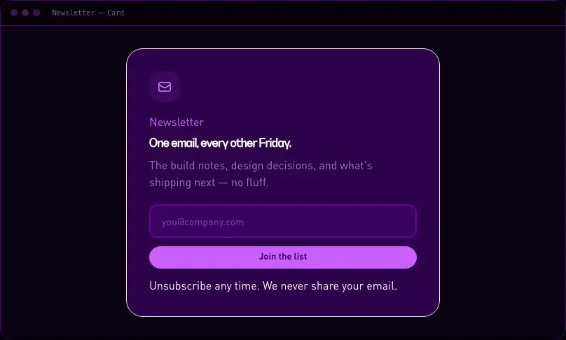
velocityx add multi-step-wizard-form react v1.0.0 Standalone card-format newsletter opt-in with an icon badge and privacy microcopy.
velocityx add newsletter-card astro v1.0.0 A slim single-row email capture bar for footers or in-content placements.
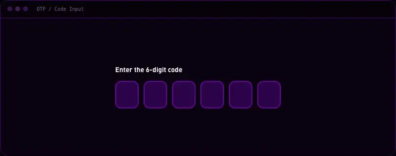
velocityx add newsletter-inline astro v1.0.0 Segmented one-time-code field with auto-advance, backspace-to-previous, and full-code paste support.
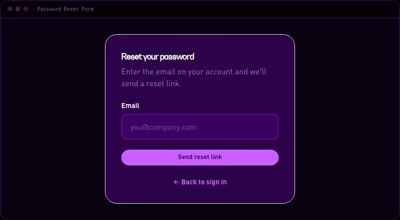
velocityx add otp-code-input react v1.0.0 Single-field reset-link request card with a built-in confirmation state toggled via a sent prop.
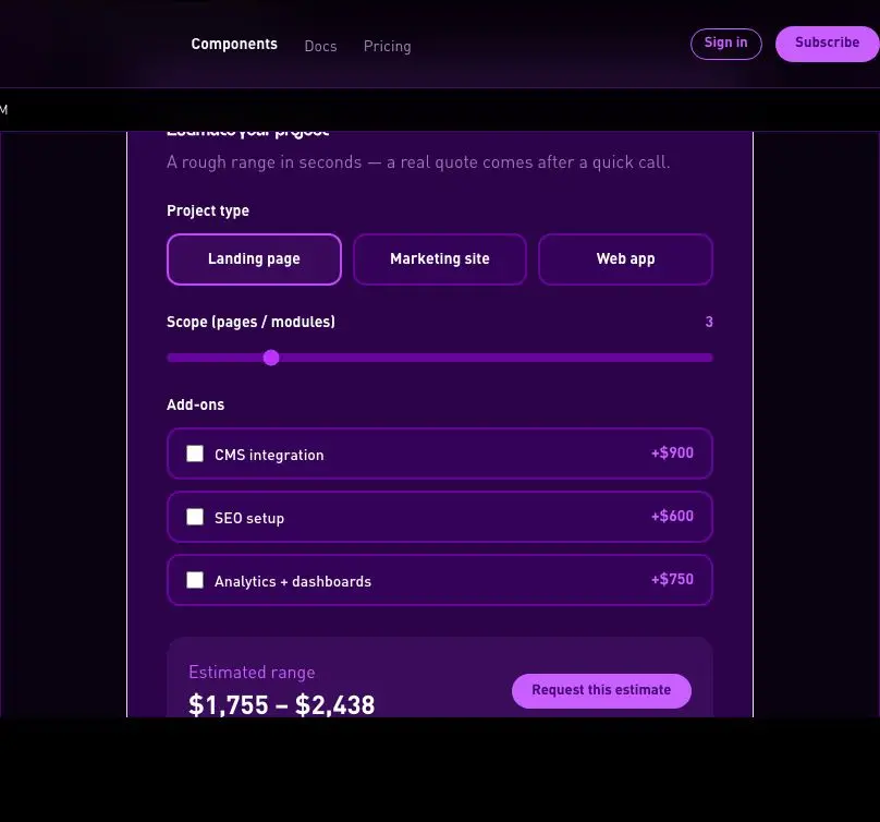
velocityx add password-reset-form astro v1.0.0 Project-type selector, scope slider, and add-on checkboxes that compute a live price range before submitting.
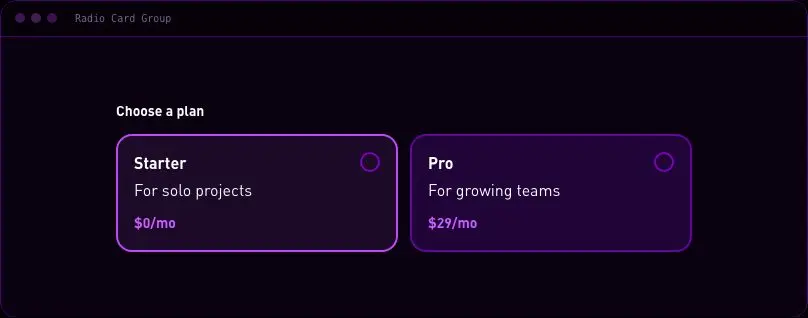
velocityx add quote-calculator-form react v1.0.0 Large selectable radio-as-card tiles for plan or shipping-method pickers, built on native radios with zero JS.
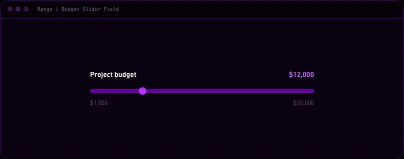
velocityx add radio-card-group astro v1.0.0 Single budget or quantity slider with a live value readout driven by a small scoped inline script.
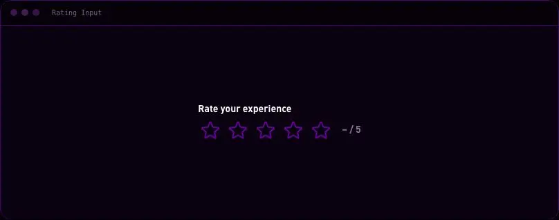
velocityx add range-slider-field astro v1.0.1 Accessible star-rating field built on labeled native radio inputs with hover preview.
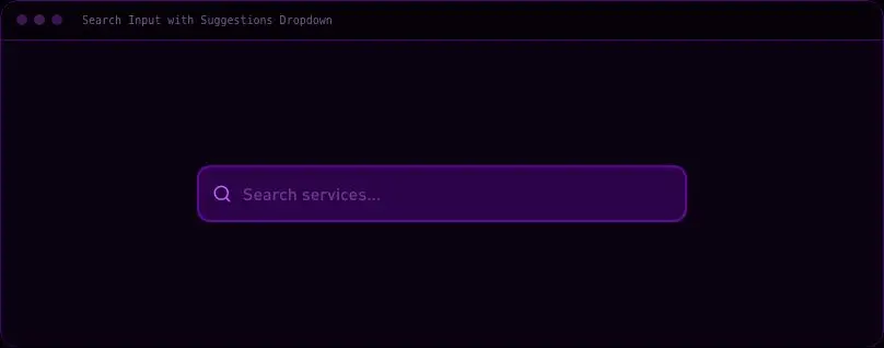
velocityx add rating-input react v1.0.0 ARIA combobox search field with keyboard-navigable, client-filtered suggestions dropdown.
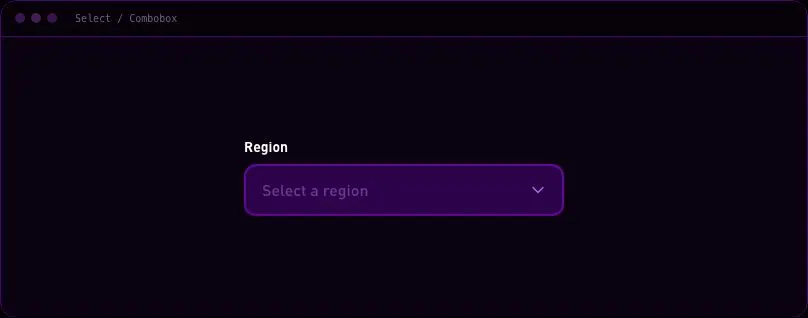
velocityx add search-input-suggestions react v1.0.0 Custom single-select ARIA listbox with type-to-filter and full keyboard support.
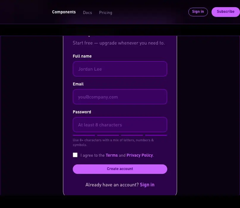
velocityx add select-combobox react v1.0.0 Name/email/password sign-up card with an inline password-strength meter and terms-acceptance checkbox.
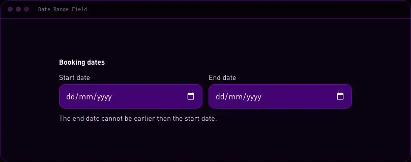
velocityx add signup-form astro v1.0.0 Two native date inputs with linked bounds that preserve an ordered start and end date.
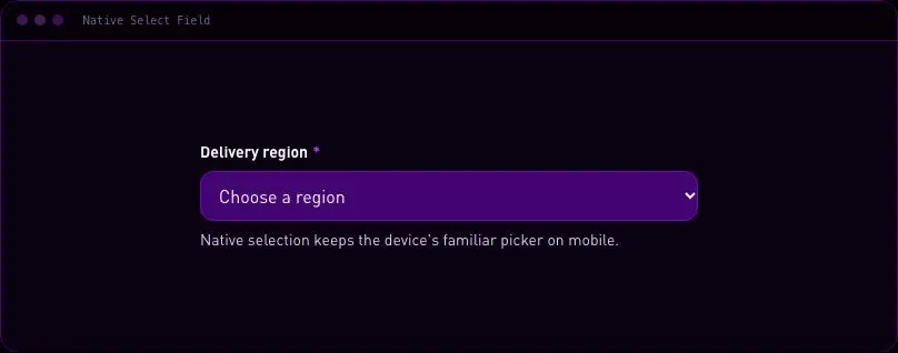
velocityx add standard-date-range-field react v1.0.0 Accessible grouped native select with a label, description, invalid state, and mobile device picker.
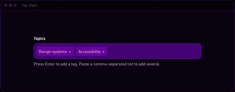
velocityx add standard-native-select-field astro v1.0.0 Keyboard-friendly tag entry with duplicate prevention, paste support, a limit, removable tokens, and form values.
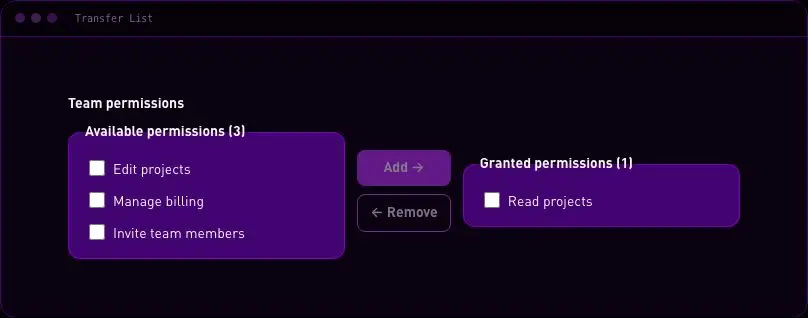
velocityx add standard-tag-input react v1.0.0 Move chosen values between labeled checkbox lists with explicit buttons and native form submission.
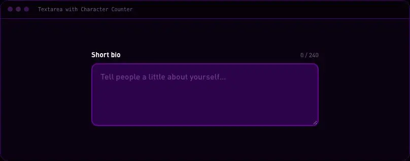
velocityx add standard-transfer-list react v1.0.0 Textarea with a live N/max counter that shifts to warning and error colour near the limit.
velocityx add textarea-character-counter astro v1.0.1 Stacked list of labeled on/off switches for notification preferences, built on native checkboxes with zero JS.
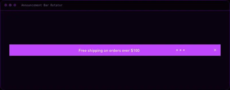
velocityx add toggle-switch-row astro v1.0.0 Top-of-page rotating announcement bar with dot indicators and a session-persistent dismiss control, vanilla JS only.
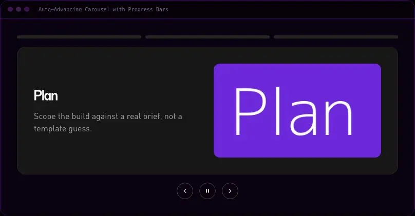
velocityx add announcement-bar-rotator astro v1.0.0 Auto-advancing carousel where segmented progress bars double as slide indicators, with pause-on-hover and a play/pause control.
velocityx add auto-carousel-progress react v1.0.0 Drag-handle before/after image comparison slider using pointer events and a keyboard-accessible slider role.
velocityx add before-after-slider react v1.0.0 Horizontal card scroller on native CSS scroll-snap with edge-aware arrow buttons and keyboard navigation.
velocityx add card-slider-snap react v1.0.0 One slide engine with three swappable indicator styles — dots, prev/next arrows only, or a numeric counter.
velocityx add carousel-indicator-variants react v1.0.0 Horizontally scrollable filter pill row with edge-fade masks, conditional nudge arrows and roving-tabindex keyboard navigation.
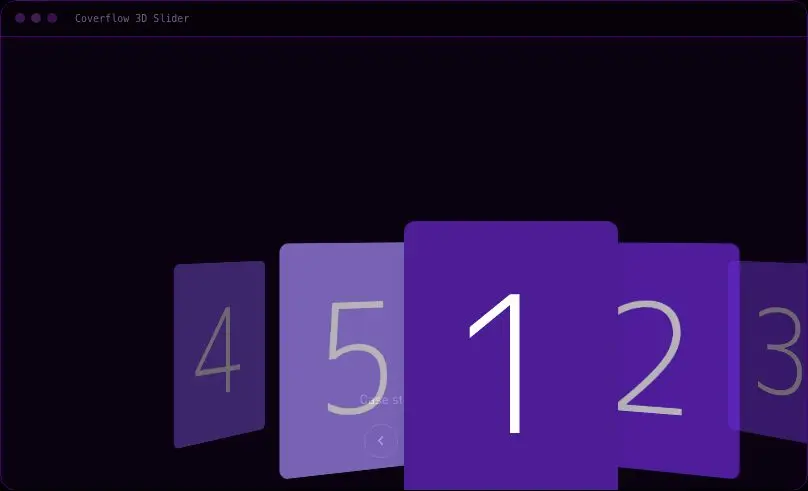
velocityx add category-pill-scroller react v1.0.0 3D coverflow-style carousel using CSS perspective and rotateY transforms, with a flattened fallback under reduced motion.
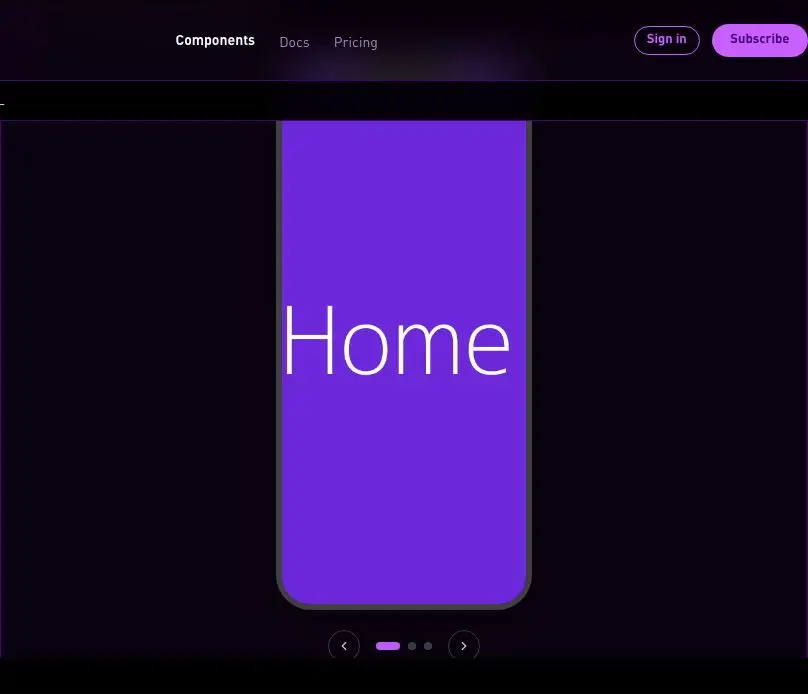
velocityx add coverflow-slider react v1.0.0 Screenshot carousel inside a CSS-drawn phone or browser-chrome frame, with crossfade, arrows, dots and swipe.
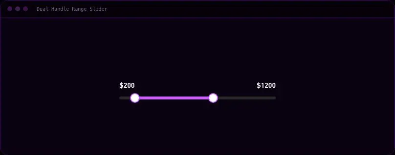
velocityx add device-frame-carousel react v1.0.0 Price/range filter with two independently draggable handles on one track, each a fully keyboard-operable slider role.
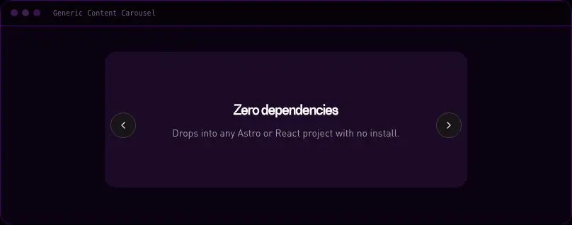
velocityx add dual-range-slider react v1.0.0 Framework-free vanilla-JS one-up carousel for arbitrary slotted content, with arrows, dots, keyboard and swipe.
velocityx add generic-content-carousel astro v1.0.0 Full-bleed crossfading hero image slider with scrim overlay, headline/CTA content, autoplay, arrows, dots and swipe.
velocityx add hero-slider-full-bleed react v1.0.0 Large image preview with a clickable, auto-scrolling thumbnail rail, arrow/keyboard navigation and swipe support.
velocityx add image-carousel-thumbnails react v1.0.0 CSS-only infinite marquee of client/partner logos that loops seamlessly in either direction and pauses on hover or focus.
velocityx add logo-ticker astro v1.0.0 Breaking-news style ticker with a fixed live tag and a CSS-only infinite-scrolling headline marquee.
velocityx add news-ticker-horizontal astro v1.0.0 Pricing cards that render as a full grid on desktop and collapse into a one-card-at-a-time snap-scroll carousel with dots on mobile.
velocityx add pricing-plan-slider react v1.0.0 Large-type quote rotator with a pure crossfade transition, autoplay, dots and an explicit pause control.
velocityx add quote-crossfade-carousel react v1.0.0 Pinned section where vertical page scroll drives horizontal image movement, falling back to a plain snap-scroll row under reduced motion.
velocityx add scroll-linked-gallery react v1.0.0 Tinder-style stacked card deck that tracks pointer drag and flies off past a threshold, with explicit accept/reject buttons as a non-drag path.
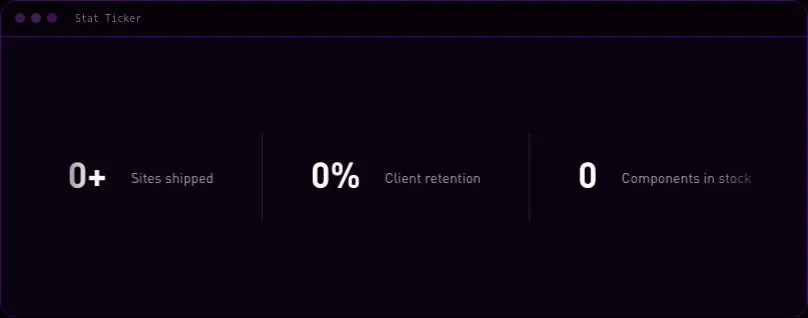
velocityx add stacked-swipe-deck react v1.0.0 CSS-only infinite marquee of stat tiles with a count-up animation triggered on scroll-into-view.
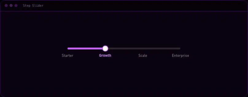
velocityx add stat-ticker astro v1.0.0 Discrete step slider snapped to labeled ticks (plan tiers, quantity breaks), draggable with full keyboard support.
velocityx add step-slider react v1.0.0 Multi-card testimonial carousel on native CSS scroll-snap showing a peek of the next card, with synced dots and arrow controls.
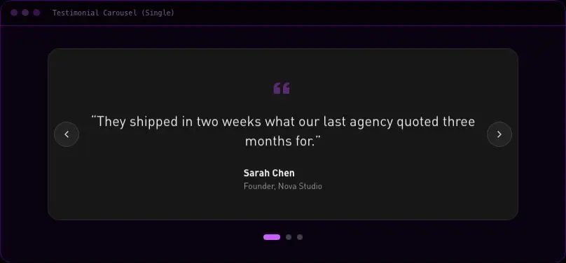
velocityx add testimonial-carousel-peek react v1.0.0 One-up crossfading testimonial carousel with arrows, dots, autoplay with pause-on-hover, swipe and keyboard navigation.
velocityx add testimonial-carousel-single react v1.0.0 CSS-only scrolling text strip for announcements, joining phrases with a separator glyph and looping infinitely.
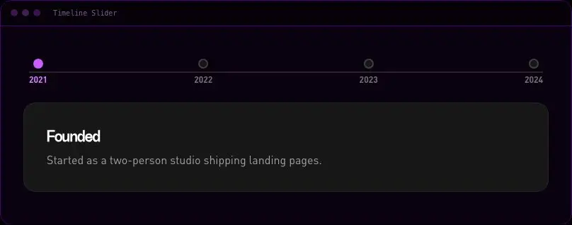
velocityx add text-marquee astro v1.0.0 Horizontal year-marker timeline with a filling progress line, clickable markers and a content panel for the active event.
velocityx add timeline-slider react v1.0.0 Vertical auto-advancing news/updates ticker with manual step controls and an explicit pause toggle.
velocityx add vertical-ticker react v1.0.0 Reserves a stable aspect ratio for media to prevent layout shift, using the native CSS aspect-ratio property.
velocityx add aspect-ratio-box astro v2.0.0 2 versions Breakpoint-free responsive card grid using CSS grid auto-fit/minmax, column count is purely a function of container width.
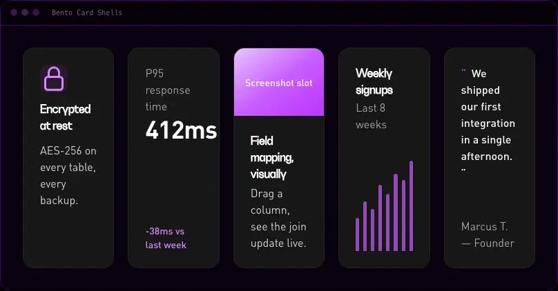
velocityx add auto-fit-grid astro v1.0.0 Single card shell component with five variants (icon, stat, image, chart-slot, quote) sharing one accessible article shell.
velocityx add bento-card-shells astro v1.0.0 Responsive 4-cell bento grid, 1 column on phone and 2x2 on tablet/desktop, with four named slots.
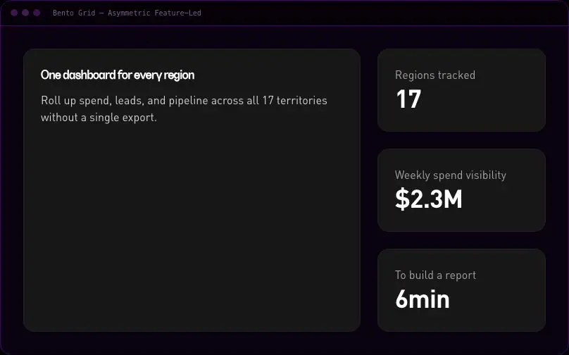
velocityx add bento-grid-4 astro v1.0.0 Feature-led bento grid with one wide lead cell plus three supporting cells, built with CSS grid-template-areas.
velocityx add bento-grid-asymmetric astro v1.0.0 Responsive 6-cell bento grid, 1/2/3 columns across phone/tablet/desktop with slots in reading order.
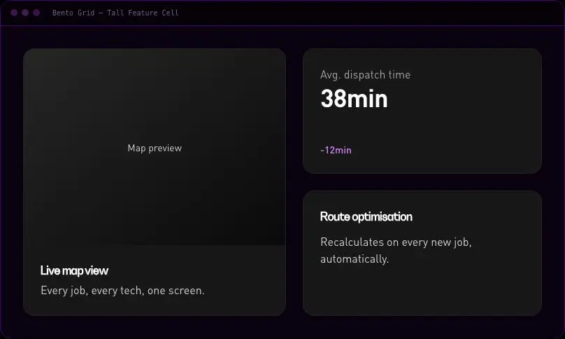
velocityx add bento-grid-six astro v1.0.0 Bento layout with one tall feature cell spanning two rows beside two stacked supporting cells.
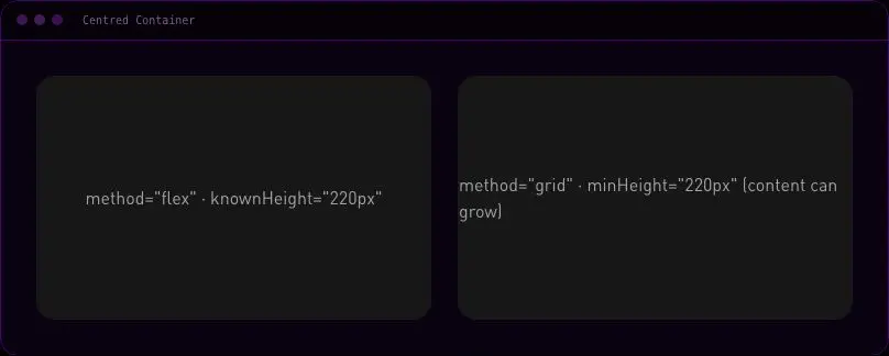
velocityx add bento-tall-feature astro v1.0.0 Reliable two-axis centring primitive with a flex or grid method and explicit known-height or min-height sizing.
velocityx add center-box astro v1.0.0 Horizontal wrapping group primitive for tag lists, pills, and button groups using flex-wrap plus gap.
velocityx add cluster astro v1.0.0 Solid, dashed, gradient-fade, and labelled divider variants with correct semantic markup for each.
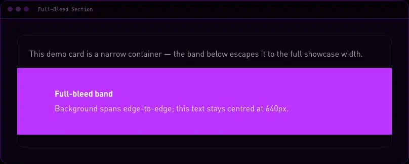
velocityx add divider astro v1.0.0 Escapes a centred max-width container to span the full viewport using the calc(50% - 50vw) technique, with a re-centred inner column.
velocityx add full-bleed astro v1.0.0 General-purpose 12-column responsive grid container where children control their own span with plain col-span utilities.
velocityx add grid-12 astro v1.0.0 Self-contained responsive horizontal padding plus centred max-width wrapper with no dependency on any host project's CSS variables.
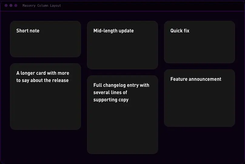
velocityx add gutter-wrapper astro v1.0.0 Pinterest-style masonry grid using native CSS multi-column layout with break-inside-avoid, zero JS.
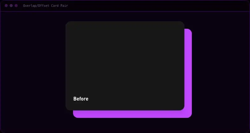
velocityx add masonry-columns astro v1.0.0 Two cards with a deliberate offset overlap using pure CSS positioning, collapsing to a simple stack on mobile.
velocityx add overlap-card-pair astro v1.0.0 Centred reading-measure column for long-form copy with sane default heading, link, and list styling.
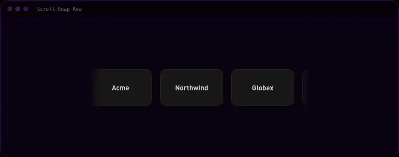
velocityx add prose-container astro v1.0.0 Horizontal scroll-snap row for cards or logos with an optional edge-fade mask, pure CSS and no carousel library.
velocityx add scroll-snap-row astro v1.0.0 Eyebrow, title, subtitle, and optional trailing action block with a required explicit heading level prop.
velocityx add section-header astro v1.0.0 Explicit, aria-hidden vertical or horizontal gap element for one-off spacing between unrelated blocks, with a flex-grow mode.
velocityx add spacer astro v1.0.0 Even two-column split section that stacks to one column on mobile, with an optional mobile reorder flag.
velocityx add split-fifty astro v1.0.0 60/40 split section where one column sticks in the viewport while the other scrolls past it, desktop only.
velocityx add split-sticky-side astro v1.0.0 Vertical rhythm primitive that spaces children with flex gap instead of margin-stacking.
velocityx add stack astro v1.0.0 Pinned sidebar with its own internal scroll next to a scrolling main content column, desktop only.
velocityx add sticky-sidebar-layout astro v1.0.0 Classic three-feature row that collapses to two then one column per breakpoint.
velocityx add three-column-feature-row astro v1.0.0 Newspaper-style two-column long-form copy split with explicit column slots, stacking to one column below desktop.
velocityx add two-column-long-copy astro v1.0.0 Expand/collapse FAQ list with measured-height animation, single or multi-open modes, and arrow-key navigation between headers.
velocityx add accordion-faq react v1.0.0 Single avatar or an overlapping stack with a plus-N overflow chip, falling back to deterministic initials-over-tint when no image is given.
velocityx add avatar-group astro v1.0.0 Floating button that fades in past a scroll threshold and scrolls to top, instantly under reduced motion.
velocityx add back-to-top react v1.0.0 Single pill component covering solid, soft, and outline badge variants across brand and semantic tones, with an optional removable tag mode.
velocityx add badge-tag astro v1.0.0 Static breadcrumb trail with BreadcrumbList microdata that collapses the middle segments into an ellipsis on long paths.
velocityx add breadcrumbs astro v1.0.0 One button primitive covering primary/secondary/ghost/destructive variants, three sizes, a loading spinner state, and an icon-only mode.
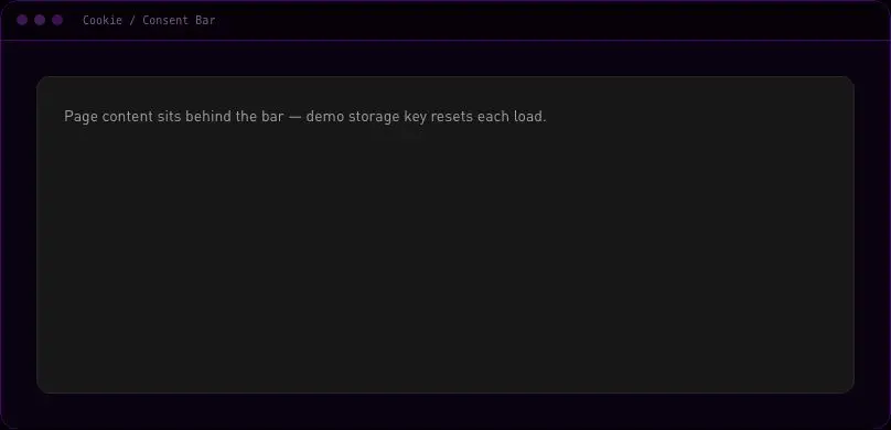
velocityx add button-set astro v1.0.0 Bottom consent bar with accept-all, reject-all, and an inline expandable preferences checklist, persisted to localStorage.
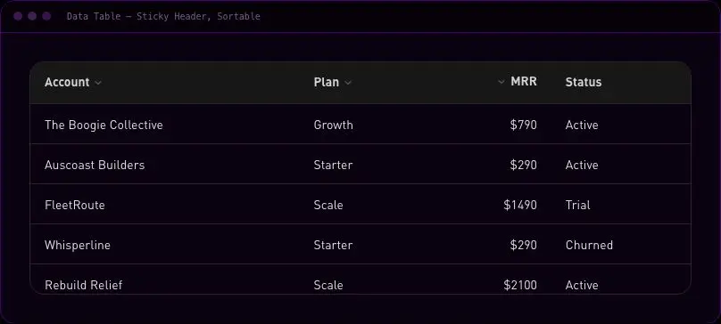
velocityx add cookie-consent react v1.0.0 Scrollable data table with a sticky header row and client-side column sorting that cycles ascending, descending, and unsorted.
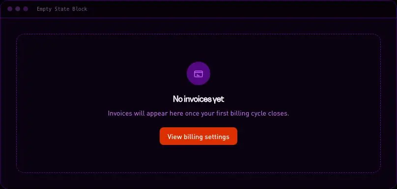
velocityx add data-table react v1.0.0 Centred placeholder for an empty list, table, or panel with an icon slot, title, description, and action slot.
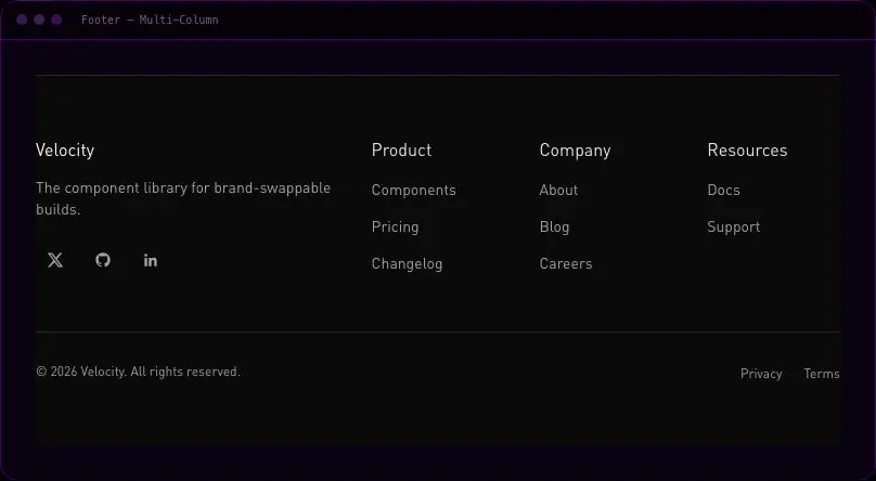
velocityx add empty-state astro v1.0.0 Brand column with description and social icons alongside N link columns, plus a bottom legal bar with copyright and policy links.
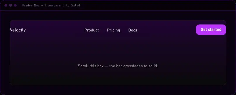
velocityx add footer-multicolumn astro v1.0.0 Sticky header that crossfades from transparent to a blurred solid bar after a scroll threshold, with primary links and a CTA.
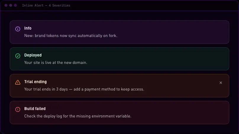
velocityx add header-nav react v1.0.0 Static inline banner covering info, success, warning, and error severities with the correct assertive/polite ARIA role per severity.
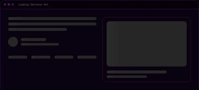
velocityx add inline-alert astro v1.0.0 Shimmer skeleton placeholders for text lines, an avatar row, a card, and a table row, with the shimmer disabled under reduced motion.
velocityx add loading-skeleton astro v1.0.0 Multi-column dropdown panel triggered from a nav item, with link columns plus an optional featured card, closing on outside click or Escape.
velocityx add mega-menu react v1.0.0 Left-docked full-height nav drawer with focus trap, outside-click close, Escape handling, scroll lock, and focus restoration.
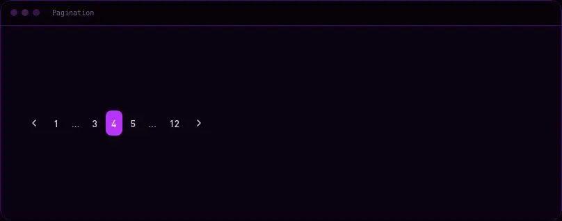
velocityx add mobile-menu-drawer react v1.0.0 Controlled numbered pager with ellipsis compression for large page counts and prev/next controls.
velocityx add pagination react v1.0.0 Click-triggered floating panel for rich content that closes on outside click or Escape and restores focus to the trigger.
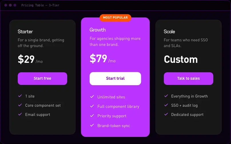
velocityx add popover react v1.0.0 Three-column pricing grid with one visually highlighted plan that scales up and sits on a brand-tinted card.
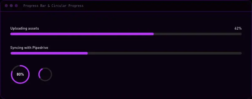
velocityx add pricing-table astro v1.0.0 Linear bar and circular ring progress indicator in one component, each with a determinate and an indeterminate mode.
velocityx add progress-indicators astro v1.0.0 The house data-entry surface — right-docked drawer on desktop, three-snap-point draggable bottom sheet on mobile, with focus trap and a dock-minimise control.
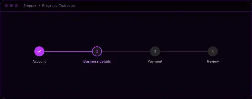
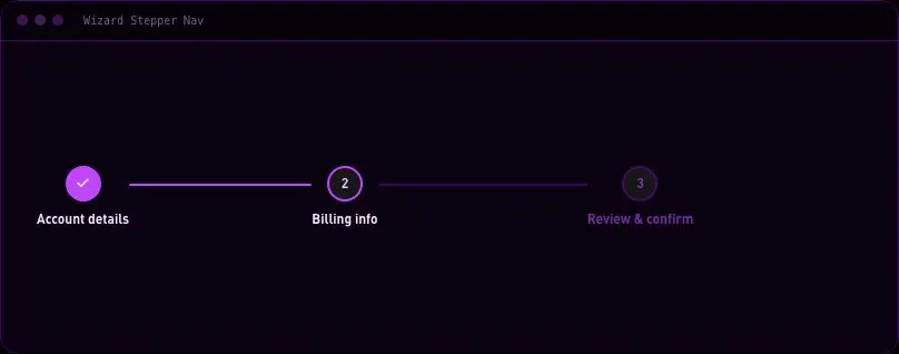
velocityx add side-drawer-panel react v1.0.0 Horizontal multi-step progress indicator with a filling connector line, collapsing to a compact step-count bar on phone.
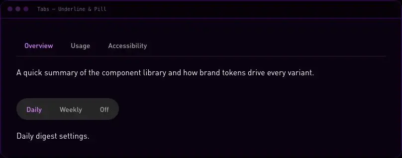
velocityx add stepper astro v1.0.0 Keyboard-accessible tab list with an animated active indicator, switchable between underline and pill visual variants via one prop.
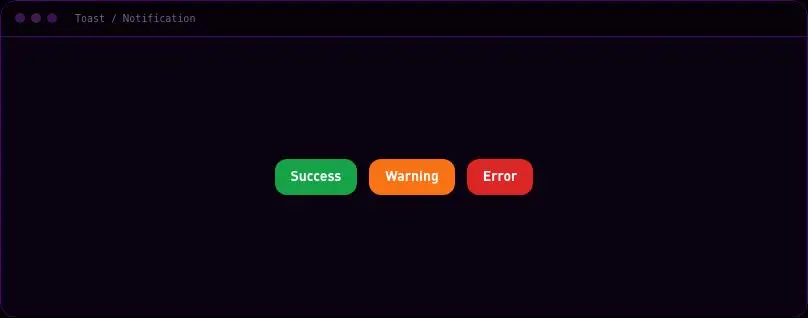
velocityx add tabs react v1.0.0 Notification stack with a module-level push/dismiss API, pausable auto-dismiss timer, and swipe-to-dismiss on touch.
velocityx add toast react v1.0.0 Hover/focus label that computes its own placement and flips side on viewport overflow, with no positioning library.
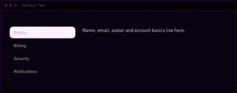
velocityx add tooltip react v1.0.1 Side-stacked tab list with a content pane, for settings-style layouts, with up/down arrow keyboard navigation.
velocityx add vertical-tabs react v1.0.0 Row of award/recognition badge tiles supplied entirely via props.
velocityx add award-badges-row astro v1.0.0 Cover image, industry tag, headline and result line linking through to a full case study.
velocityx add case-study-card astro v1.0.0 Row of metric tiles for the headline numbers inside a case study.
velocityx add case-study-results-band astro v1.0.0 Full section wrapper around a CSS-only scrolling logo strip that stops entirely under reduced motion.
velocityx add client-logo-marquee-section astro v1.0.0 Primary CTA block paired with a single supporting testimonial in a side column.
velocityx add cta-testimonial-sidebar astro v1.0.0 Full FAQ section built on native details/summary, zero runtime JS.
velocityx add faq-accordion-section astro v1.0.0 Icon-led guarantee block with headline, supporting copy and optional CTA.
velocityx add guarantee-panel astro v1.0.0 Plain responsive grid of client logos with text fallback when a logo is missing.
velocityx add logo-wall-grid astro v1.0.0 Logo grid that desaturates by default and lifts to full colour on hover or keyboard focus.
velocityx add logo-wall-hover-color astro v1.0.0 Newsletter signup with subscriber-count proof line and stacked avatar group, no backend assumed.
velocityx add newsletter-social-proof astro v1.0.0 As-featured-in row of press outlet logos with optional article links.
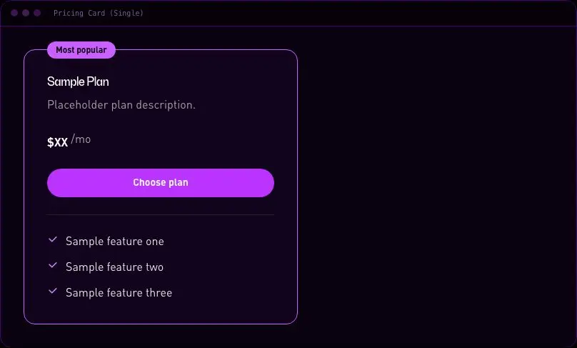
velocityx add press-mentions-row astro v1.0.0 One standalone plan card with price, feature list, badge and CTA.
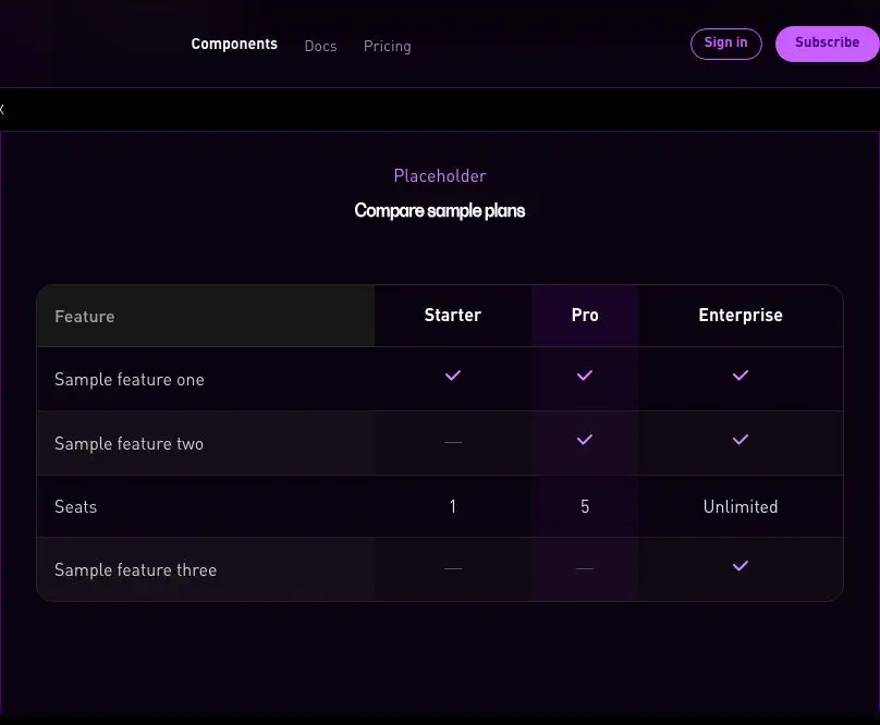
velocityx add pricing-card-single astro v1.0.0 Row-per-feature plan comparison table with tick, dash and text cell values.
velocityx add pricing-feature-matrix astro v1.0.0 Monthly/annual billing switch that reveals a savings badge on the annual side.
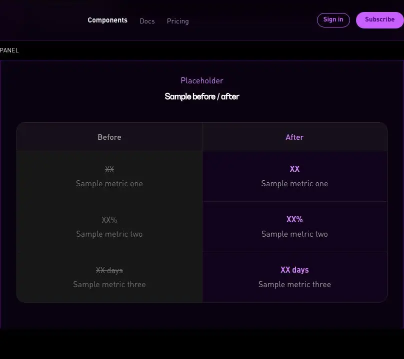
velocityx add pricing-toggle react v1.0.0 Static side-by-side before/after metric comparison panel, not an image slider.
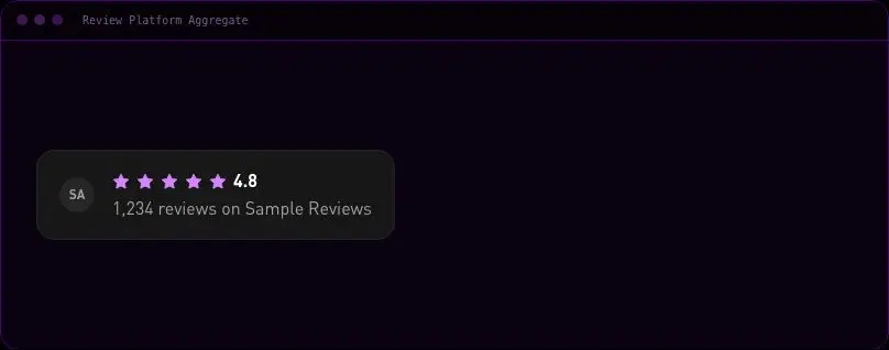
velocityx add results-before-after-panel astro v1.0.0 Stars, numeric score and review count for a named review platform, with a visible text equivalent.
velocityx add review-platform-aggregate astro v1.0.0 Grid of stat tiles that count up on scroll into view, disabled entirely under reduced motion.
velocityx add stat-counter-grid react v1.0.0 Section header plus a responsive grid of team member cards.
velocityx add team-grid astro v1.0.0 Headshot, name, role, bio and social links for a single team member.
velocityx add team-member-card astro v1.0.0 Single quote card with optional star rating and avatar/initials fallback.
velocityx add testimonial-card astro v1.0.0 Large standalone quote paired with a portrait for one standout endorsement.
velocityx add testimonial-featured astro v1.0.0 Section header plus a responsive 3-column grid of quote cards.
velocityx add testimonial-grid-3up astro v1.0.0 Native video element with poster and caption, zero runtime JS.
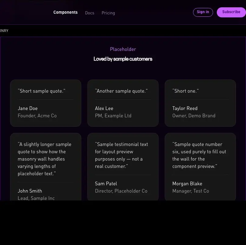
velocityx add testimonial-video-card astro v1.0.0 Dense CSS-columns masonry wall of quotes with no JS masonry library.
velocityx add testimonial-wall-masonry astro v1.0.0 Row of security/compliance trust marks, each optionally linking out.
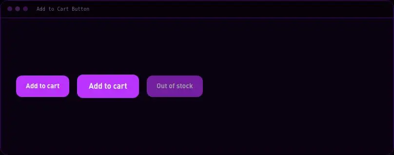
velocityx add trust-badge-row astro v1.0.0 Primary CTA with loading, success checkmark and error states around an async add-to-cart handler.
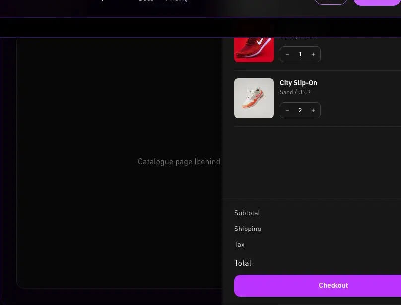
velocityx add add-to-cart-button react v1.0.0 Right-docked cart drawer on desktop and a three-snap-point bottom sheet on mobile, with no backdrop-blur scrim, focus trap and Escape to close.
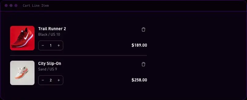
velocityx add cart-drawer react v1.0.0 Single cart row with thumbnail, variant text, quantity stepper, line total and a fade-out remove action.
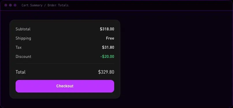
velocityx add cart-line-item react v1.0.0 Order totals block listing subtotal, shipping, tax and discount rows that only render when passed, plus a grand total.
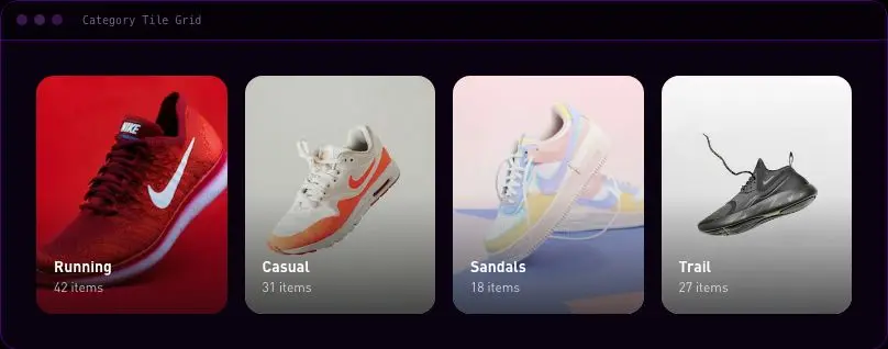
velocityx add cart-summary astro v1.0.0 Responsive image-and-label tile grid linking into catalogue categories, with an optional item count.
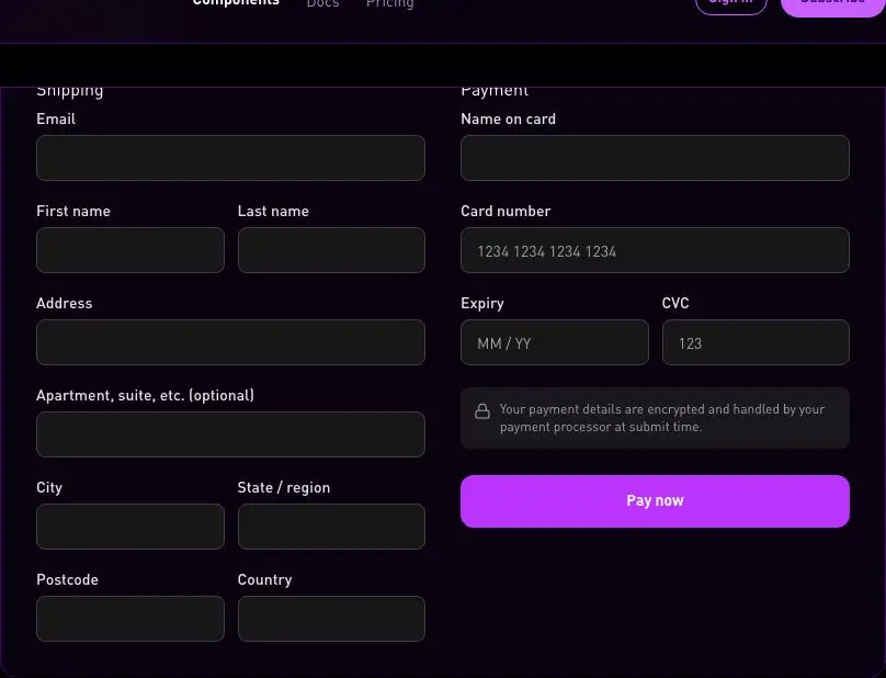
velocityx add category-tile-grid astro v1.0.0 Two-column shipping and payment form with native HTML5 validation and a submit button with a loading state.
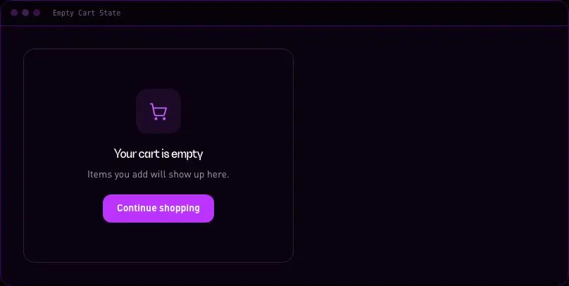
velocityx add checkout-form react v1.0.0 Centred placeholder for an empty cart with icon, copy and a continue-shopping CTA.
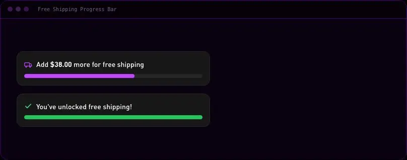
velocityx add empty-cart-state astro v1.0.0 Animated fill bar showing amount remaining to a free-shipping threshold, swapping to a success message once met.
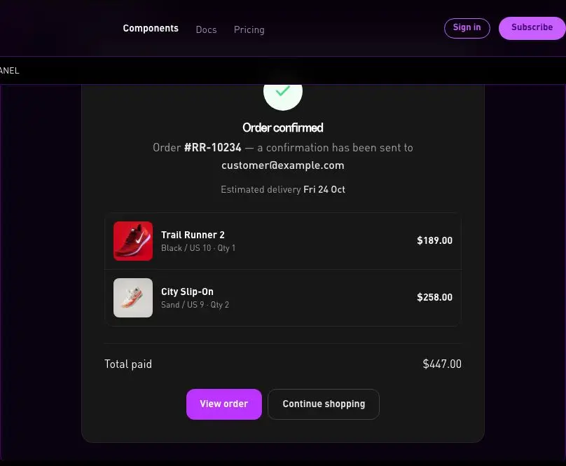
velocityx add free-shipping-progress-bar react v1.0.0 Post-checkout success panel with order number, delivery estimate, line items and total paid.
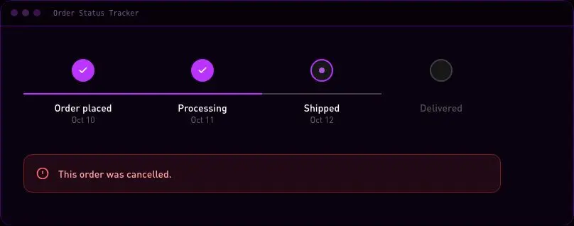
velocityx add order-confirmation-panel astro v1.0.0 Horizontal (vertical on mobile) step tracker for order lifecycle stages, with a dedicated cancelled-order state.
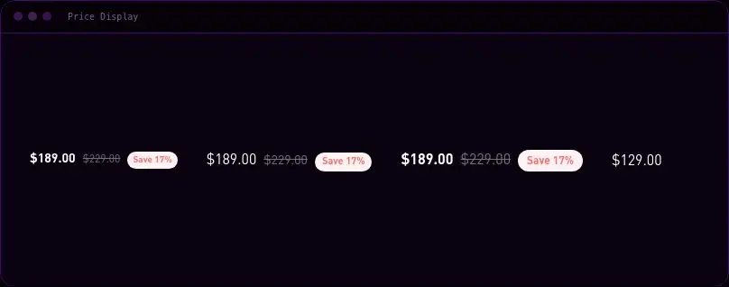
velocityx add order-status-tracker astro v1.0.0 Formatted price with optional struck-through compare-at price and a percentage-off badge, in three sizes.
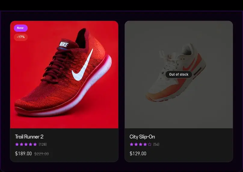
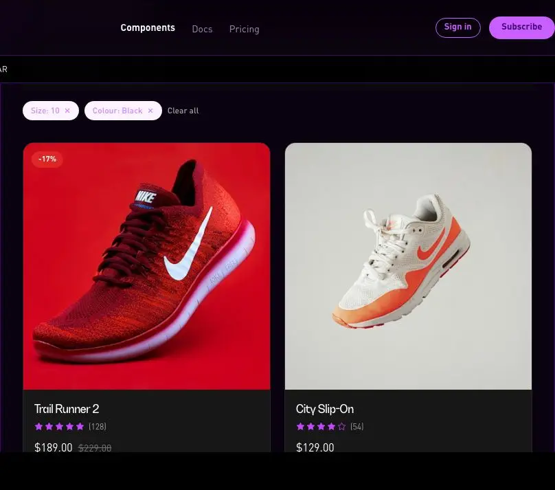
velocityx add price-display astro v1.0.0 Catalogue grid tile with image, title, rating, price with compare-at discount badge, and an out-of-stock overlay.
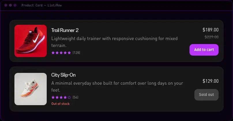
velocityx add product-card-grid astro v1.0.0 Horizontal row card for search results or dense catalogue lists, with an action slot for cart/wishlist buttons.
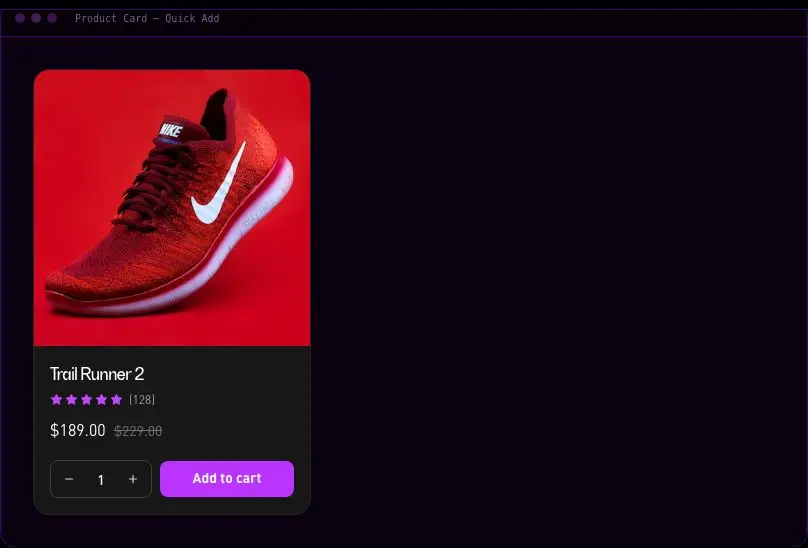
velocityx add product-card-list astro v1.0.0 Grid product card with an inline quantity stepper and add-to-cart control that shows a loading then success state.
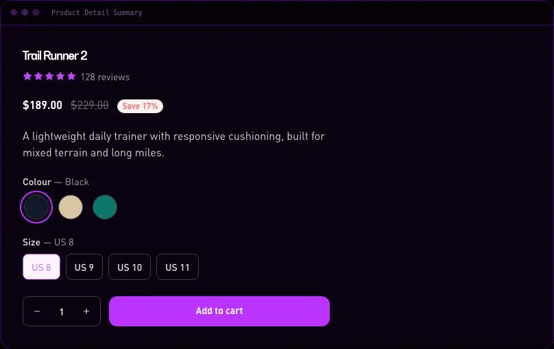
velocityx add product-card-quick-add react v1.0.0 PDP summary block bundling title, price, colour/size variant pickers, quantity stepper and an add-to-cart button with success state.
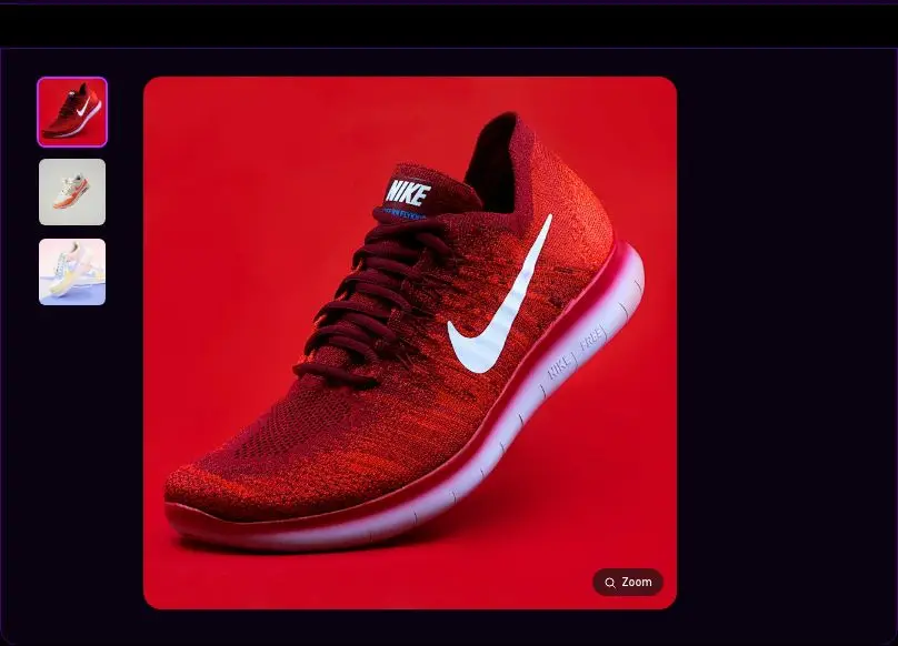
velocityx add product-detail-summary react v1.0.0 Main image with thumbnail rail, hover magnifier lens, and a fullscreen zoom view with keyboard navigation.
velocityx add product-gallery-zoom react v1.0.0 Sticky filter/sort bar with active filter chips, result count, and sort select that wraps a product grid via children.
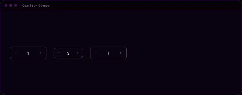
velocityx add product-grid-filter-bar react v1.0.0 Numeric stepper with min/max clamping, direct type-in and a disabled state, used across cart and PDP.
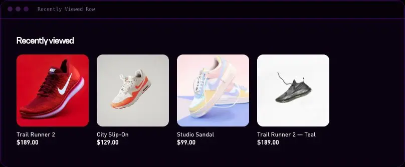
velocityx add quantity-stepper react v1.0.0 Horizontally scrolling rail of small product tiles using native scroll-snap, no carousel library.
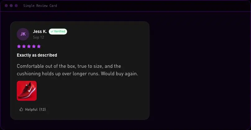
velocityx add recently-viewed-row astro v1.0.0 Customer review card with avatar/initials, verified badge, star rating, photos row and a progressively-enhanced helpful-vote button.
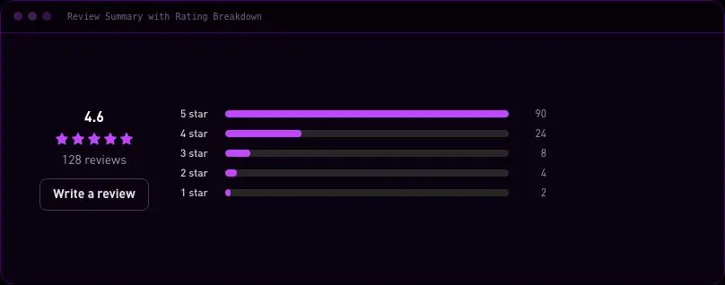
velocityx add review-card astro v1.0.1 Average rating, star row and review count beside a 5-to-1 star horizontal bar breakdown with counts.
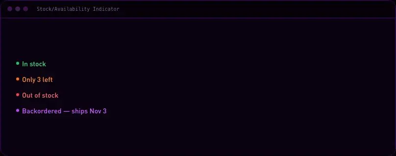
velocityx add review-summary astro v1.0.0 Dot-and-label status line that derives in-stock/low-stock/out-of-stock from a quantity and threshold, or accepts an explicit status.
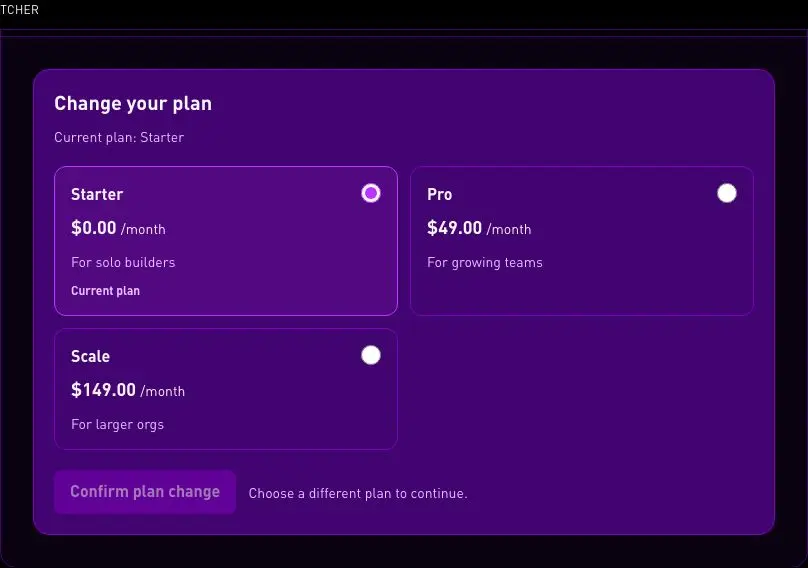
velocityx add stock-availability-indicator astro v1.0.0 Accessible plan selection for an existing subscription, showing the current plan and collecting explicit confirmation. Billing and proration remain in the host app.
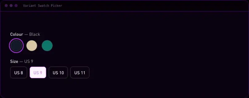
velocityx add subscription-plan-switcher react v1.0.0 Colour swatch and size button picker with per-combination availability so unavailable sizes show struck-through instead of disappearing.
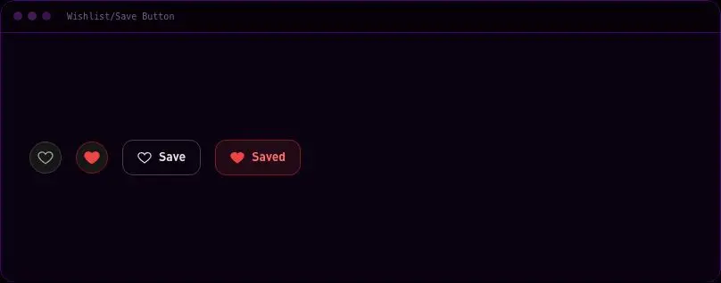
velocityx add variant-swatch-picker react v1.0.0 Heart toggle with a pop animation on save, in an icon-only or labelled-pill variant.
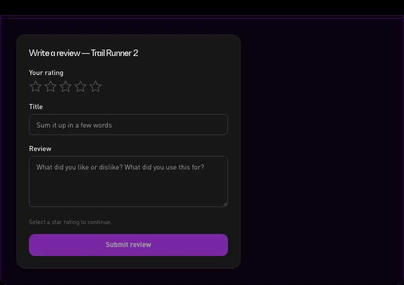
velocityx add wishlist-button react v1.0.0 Interactive star-rating picker with title and body fields, native validation, and a success confirmation state.
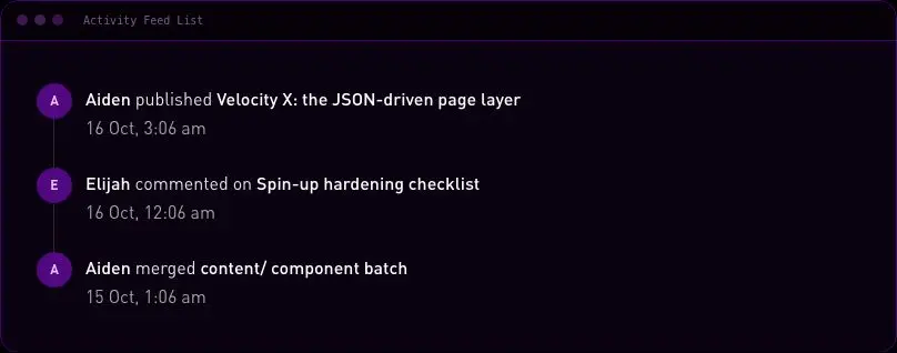
velocityx add write-review-form react v1.0.0 Vertical timestamped activity feed with a connecting dot-and-line rail between entries.
velocityx add activity-feed-list astro v1.0.0 Two-column article layout with a reader-width prose column and a sticky sidebar slot that collapses above content on mobile.
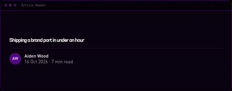
velocityx add article-body-sidebar astro v1.0.0 Article title, byline, avatar, publish/updated date and read time above a divider.
velocityx add article-header astro v1.0.0 Avatar, name, role, short bio and optional social links for an article sidebar or footer.
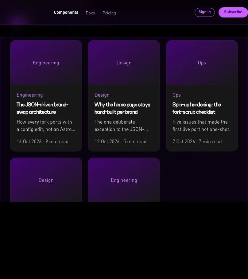
velocityx add author-bio-card astro v1.0.0 Client-filtered blog index grid driven by a category pill row built from the posts data.
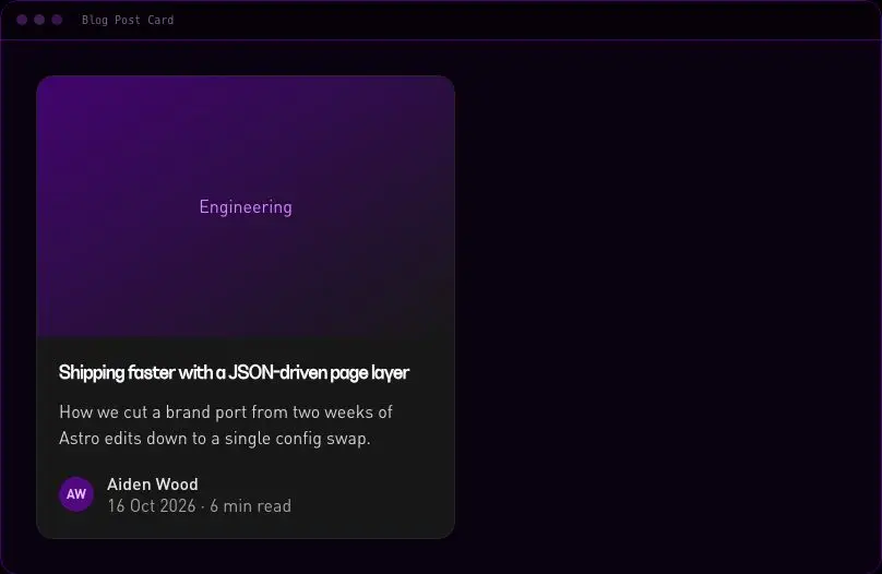
velocityx add blog-index-grid react v1.0.0 Vertical blog post card with cover image, category eyebrow, title, excerpt, and author/date/read-time meta row.
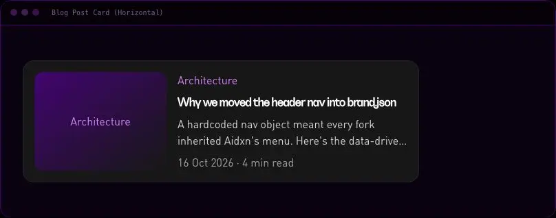
velocityx add blog-post-card astro v1.0.0 Image-left, content-right post card for dense list views that stacks to image-top on mobile.
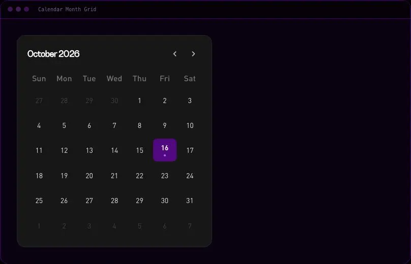
velocityx add blog-post-card-horizontal astro v1.0.0 Month calendar grid with prev/next navigation, locale-aware weekday/month labels via Intl, and per-day event dots.
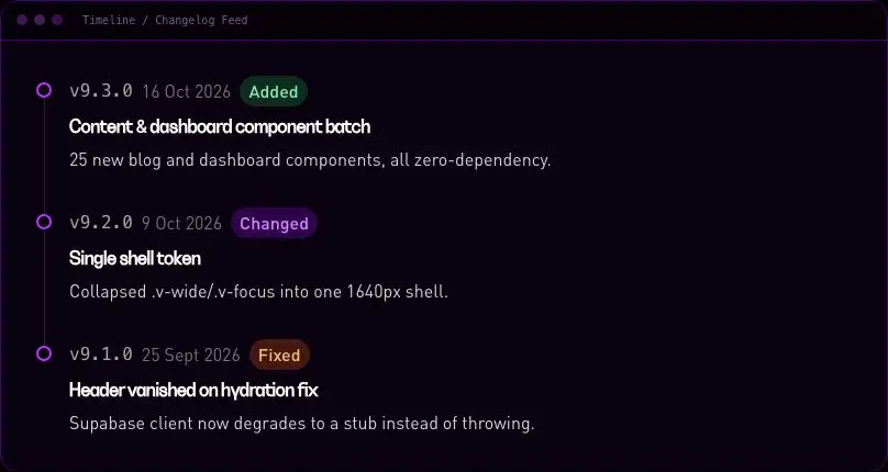
velocityx add calendar-month-grid react v1.0.0 Dated release/changelog entries on a vertical rail with version, date and a coloured change-type tag.
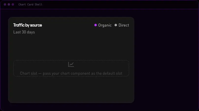
velocityx add changelog-timeline-feed astro v1.0.0 Dashboard card chrome with title, sub, a legend built from a series prop, and a default slot for any host-supplied chart.
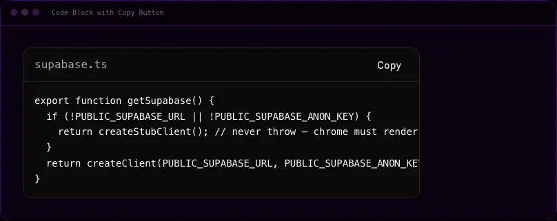
velocityx add chart-card-shell astro v1.0.1 Styled pre/code block with a filename bar and a copy button with a real success state, no syntax highlighter bundled.
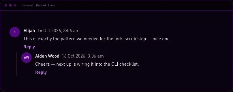
velocityx add code-block-copy react v1.0.0 Single comment with avatar, author, date and body that recursively renders nested replies up to a capped indent depth.
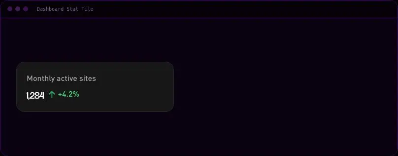
velocityx add comment-thread-item astro v1.0.0 Single KPI tile with label, large value, optional icon slot and a directional delta badge.
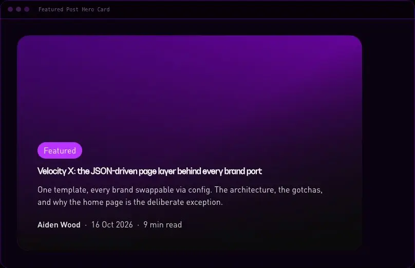
velocityx add dashboard-stat-tile astro v1.0.0 Full-bleed editorial hero card for a pinned blog post with a solid scrim over the cover image for legibility.
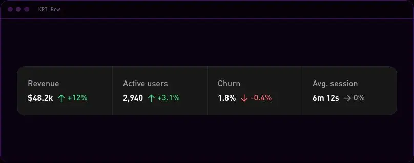
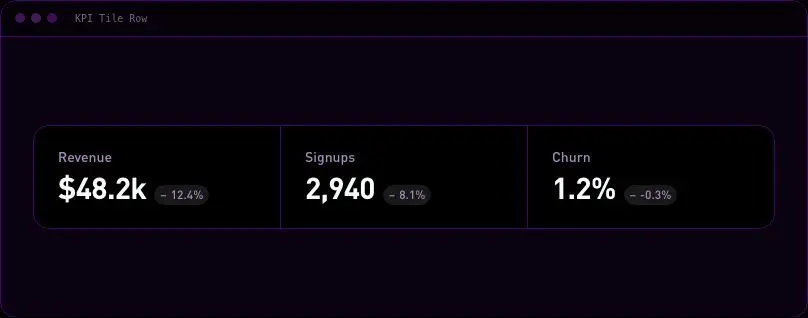
velocityx add featured-post-hero astro v1.0.0 Horizontal row of KPI figures sharing one divided card for a dashboard header strip.
velocityx add kpi-row astro v1.0.0 Inline subscribe block for the end of an article, a plain form with a host-supplied action/method.
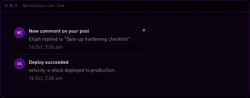
velocityx add newsletter-article-block astro v1.0.0 Single notification row with avatar/icon, message, timestamp and an unread indicator dot.
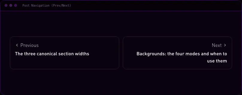
velocityx add notification-list-item astro v1.0.0 Previous/next post navigation links with directional chevrons, stacking to one column on mobile.
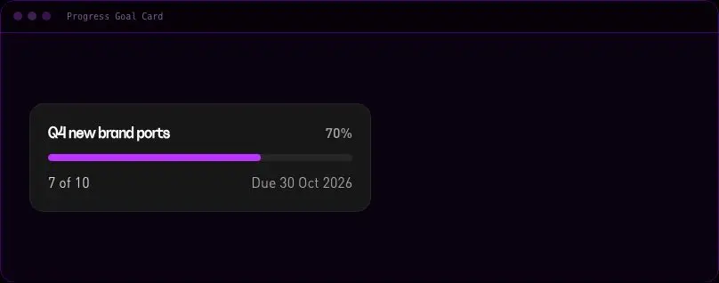
velocityx add post-navigation astro v1.0.0 Single-goal card with a computed percentage progress bar, current/target values and an optional due date.
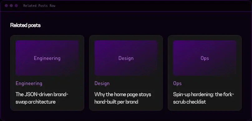
velocityx add progress-goal-card astro v1.0.0 Compact grid of 2-4 related post cards for the end of an article.
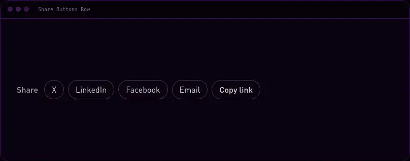
velocityx add related-posts-row astro v1.0.0 Share-to-platform link row (X, LinkedIn, Facebook, Email) plus a copy-link button with a real success state.
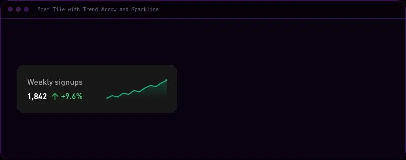
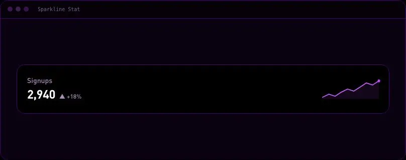
velocityx add share-buttons-row react v1.0.0 KPI tile with a trend arrow and a hand-drawn inline SVG sparkline computed from a numbers array, no chart library.
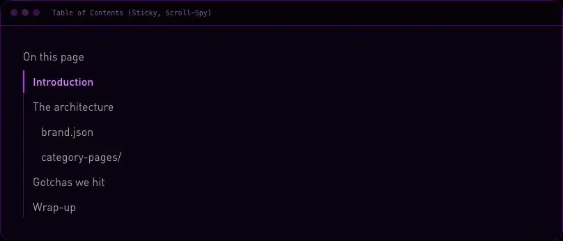
velocityx add stat-tile-trend-sparkline react v1.0.1 Sticky table of contents with IntersectionObserver-driven scroll-spy highlighting that degrades to a plain link list without observer support.
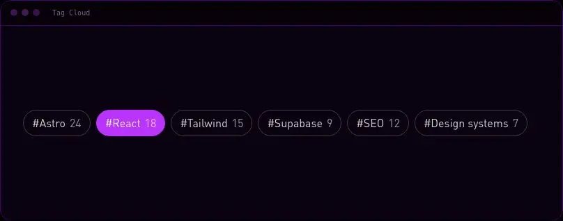
velocityx add table-of-contents react v1.0.0 Wrapping row of tag pills with optional count and active state for a tag archive page.
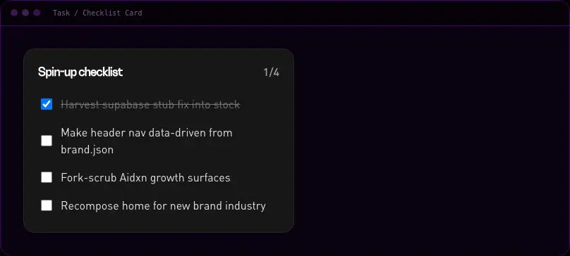
velocityx add tag-cloud astro v1.0.0 Card of checkable tasks with a done/total count, supporting both internal state and parent-controlled toggling.
velocityx add task-checklist-card react v1.0.0 Calm, full-bleed aurora wash of drifting colour fields for hero and section backdrops. Pure CSS, no canvas or JS, fixed low opacity so body text keeps AA contrast on top.
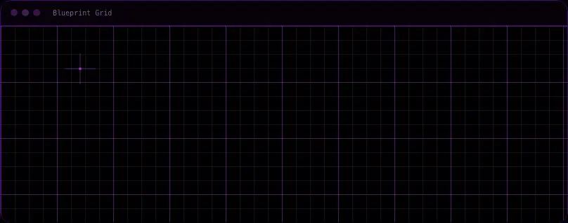
velocityx add aurora-drift astro v1.0.1 A static technical drafting-table grid with fine minor rules, bolder major rules every few cells, and a faint crosshair origin marker — a precise, no-motion backdrop for engineering, CAD and dev-tool pages.
velocityx add blueprint-grid astro v1.0.1 Soft, out-of-focus circles in varied sizes and blur drifting gently behind your content, like camera bokeh behind a subject. Warm and photographic rather than geometric — a gentle backdrop for testimonials, pricing, and about pages.
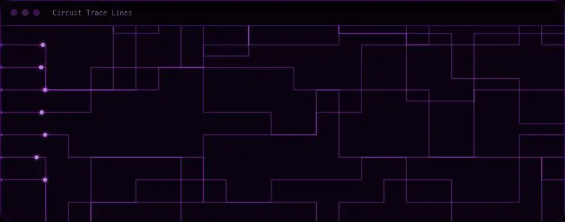
velocityx add bokeh-orbs astro v1.0.1 PCB-style wiring paths with travelling light pulses, giving technical and infrastructure pages a systems-and-signal backdrop without any canvas or extra dependency.
velocityx add circuit-trace-lines react v1.0.1 Slow drifting field of points that link into triangles when close, like a star map redrawing itself. A calm 'data / network / intelligence' backdrop for dashboard, pricing, and AI-product heroes.
velocityx add constellation-field react v1.0.2 A slow, restrained drift of diagonal bands behind a section — reads as quiet motion rather than decoration, so body copy, forms and pricing tables stay fully legible on top.
velocityx add diagonal-stripe-drift astro v1.0.1 Three depth layers of a dot matrix that drift at different rates with the pointer, giving a flat section real depth. The structured counterpart to free-floating particle backgrounds — sits behind pricing tables, feature grids, and app screenshots.
velocityx add dot-grid-parallax react v1.0.1 Stripe-style ribbon of thin lines that twists in pseudo-3D — additive blending lights up a glowing fold where the lines bunch. Pure canvas, zero dependencies.
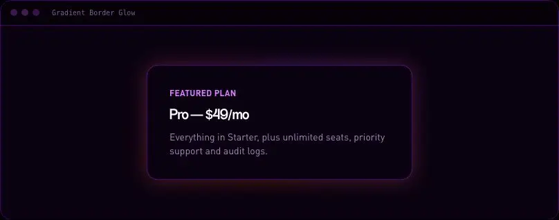
velocityx add flow-lines react v1.0.1 An animated glowing gradient frame that traces the edge of a card or section to single it out — a rotating ring plus soft halo, never a fill, so the content inside stays untouched.
velocityx add gradient-border-glow astro v1.0.1 Film-grain texture layer that kills gradient banding and flat-colour plasticky sections. Zero JS, zero canvas — an SVG noise filter with a gentle four-step flicker.
velocityx add grain-overlay astro v1.0.1 A print-style halftone screen whose dots genuinely shrink across the section, like a Ben-Day tone fading to paper. Gives editorial, comic, or print-brand sections real texture instead of a flat gradient, with zero client-side JS.
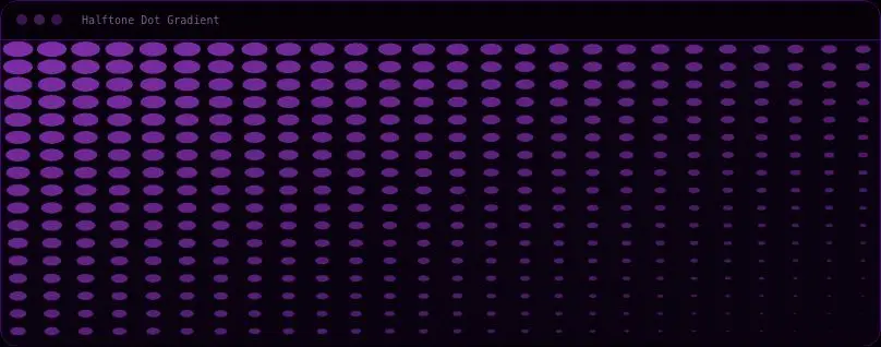
velocityx add halftone-dot-gradient astro v1.0.1 A wireframe lattice of isometric cubes that drifts sideways at a pace too slow to notice as motion, only as alive. Sits quietly behind pricing tables, dashboards, and dev-tool marketing pages without competing with copy on top.
velocityx add isometric-cube-field react v1.0.1 An analogue-film light leak hugging one corner, warm colour streaks drifting slowly like mis-loaded stock. Adds instant warmth and texture to photography, film, and brand-story sections without a stock-photo overlay.
velocityx add light-leak-wash astro v1.0.1 Generative maze that grows outward from a seed cell, drawing itself as a living background. Canvas-based, self-contained, pauses when off screen and stops entirely under prefers-reduced-motion.
velocityx add maze-growth astro v1.0.1 Four soft, oversized colour blobs with morphing organic edges that glide slowly behind content, like a modern gradient-mesh backdrop. Pure CSS, no canvas or JS, fixed low opacity so body text keeps AA contrast on top.
velocityx add mesh-gradient-blobs astro v1.0.1 A fine fibre-grain surface for editorial sections and long-form reading panels — calmer and more static than a film-grain overlay, like uncoated paper stock instead of a scanned photo.
velocityx add paper-texture astro v1.0.1 A tilted grid receding to a glowing horizon, drifting slowly forward — the retro-tech synthwave floor, played tasteful rather than loud, for hero sections behind a product shot or a developer-tool landing page.
velocityx add perspective-grid-floor astro v1.0.1 Slow concentric rings expanding from an off-centre point, like a stone dropped in still water. Pure CSS, built for dark hero sections that want quiet, premium motion without the weight of a canvas loop.
velocityx add ripple-wave-field astro v1.0.1 Retro-CRT scanline texture with a slow diagonal light sweep, for terminal, dev-tool, and dark dashboard heroes that need hardware texture instead of flat black. Pure CSS, zero JS.
velocityx add scanline-glow astro v1.0.1 A calm field of drifting motes, each sized and faded differently, rising slowly behind content for quiet ambient depth without the sparkle or clutter of a festive particle effect.
velocityx add soft-floating-particles astro v1.0.2 A single soft beam of light passing over a dark section with a quiet top-down vignette, like a stage spotlight crossing the back wall. One deliberate moment of motion for dark hero panels and feature reveals, not a busy texture. Pure CSS, no canvas or JS.
velocityx add spotlight-sweep astro v1.0.1 A quiet, layered field of drifting stars that gives any dark section real depth — near points move faster and glow brighter, far points barely shift. Reads as premium and spacious, not busy, and never distracts from content laid over the top.
velocityx add starfield-depth-drift react v1.0.2 A quiet hexagon or triangle grid with one soft highlight travelling across it, like light catching a cut-glass surface. The grid is drawn to canvas once (on mount and resize, never per frame); only a single masked CSS transform animates, so it costs nothing while idle. Built for pricing tables, technical docs, and enterprise-leaning sections.
velocityx add tessellation-field react v1.0.1 Stacked elevation-map contour lines that breathe in and out like a slow survey map. Gives fintech, mapping, and B2B-data sections a technical backdrop without another gradient blob. SSR-deterministic SVG, zero JS.
velocityx add topographic-contours astro v1.0.1 A soft breathing edge-darkening that pulls focus back to centred content — built for hero statements and single-CTA sections that want quiet emphasis, not a hard spotlight.
velocityx add vignette-pulse astro v1.0.1 Diagonal line field whose drift and tilt are driven by actual scroll position, not a timed loop — native scroll-timeline CSS where supported, rAF fallback elsewhere. Reverses on scroll-up, freezes the instant scrolling stops.
velocityx add scroll-depth-field react v1.0.1 A stack of independent cards where opening one smoothly expands its detail and closes any other open card, while every card's summary stays legible whether open or closed. Height animates off the panel's real measured content, so there's never a layout jump.
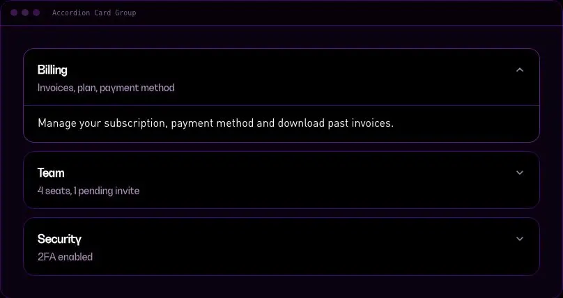
velocityx add accordion-card-group react v1.0.1 The loading shape for a grid of cards — media block, title line, sub line, sized to match real card dimensions so the grid doesn't shift when data arrives. Ships media, list and stat variants; static (not faster) under reduced motion and hidden from screen readers.
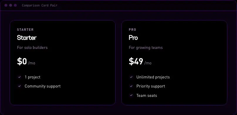
velocityx add card-grid-skeleton react v1.0.1 Two options side by side for an A-vs-B decision point — plan tiers, old-vs-new, build-vs-buy — stacking on mobile, with one card raised and badged as the recommended pick.
velocityx add comparison-card-pair astro v1.0.1 A directory entry — avatar, name, role, a short list of real tel/email/location contact methods, and one primary action. Built for a staff directory or "your account manager" block, not a hover-reveal bio tile.
velocityx add contact-person-card react v1.0.1 A learning-dashboard tile showing course title, lesson completion as both a bar and a written count, time remaining, and a resume action — built for a "continue where you left off" rail.
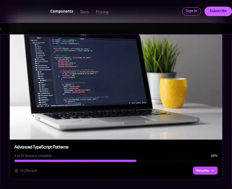
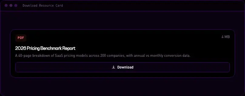
velocityx add course-progress-card astro v1.0.1 A content-offer tile for a resource library or lead-magnet grid — file type badge, title, short description, locale-formatted size, and a download action. Built for a standalone promotional grid, not a stacked attachment list.
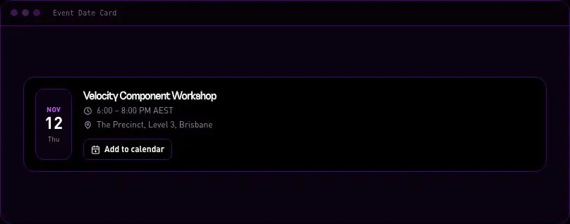
velocityx add download-resource-card astro v1.0.1 A listing row for a meetup, webinar or conference session — a prominent day/month date block, title, location and time, with a one-click add-to-calendar download that generates a real .ics file by hand. No calendar SDK, works even with JS disabled.
velocityx add event-date-card astro v1.0.2 Card that expands into a focused overlay on desktop and a draggable bottom sheet on mobile, with three snap points. Portal-rendered, focus-trapped, scroll-locked and reduced-motion aware.
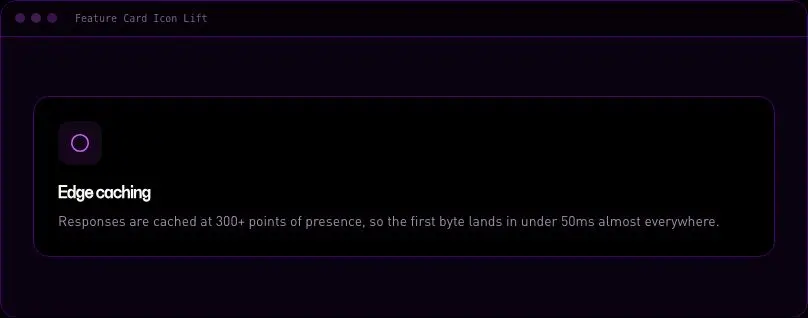
velocityx add expandable-card react v1.0.1 The standard feature-grid tile — icon, title and one line of copy that lifts and shadows on hover and focus, so a row of them reads as tactile instead of flat text in boxes.
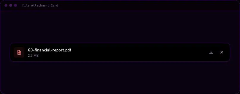
velocityx add feature-card-icon-lift astro v1.0.1 A row for an upload list or attachment drawer — type icon, filename, locale-formatted file size, and download/remove actions. Built for stacking one per uploaded file, with the remove action firing a hook event so you can wire real deletion.
velocityx add file-attachment-card astro v1.0.1 Full-bleed photo card with title and copy sat over a bottom scrim, tuned so white text stays readable against a bright sky shot exactly as reliably as a dark one — no manual contrast tweaking per image.
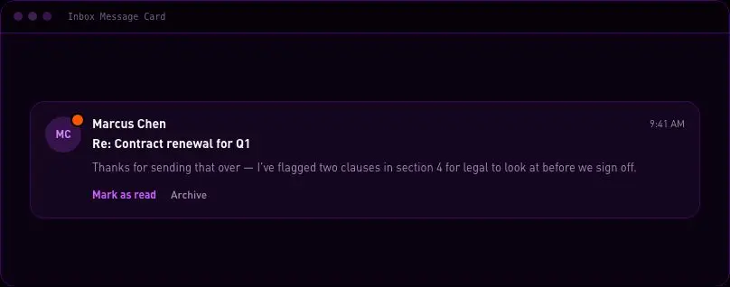
velocityx add image-overlay-gradient-card react v1.0.1 A full inbox or notification-centre card — sender avatar, subject, clamped preview, timestamp, unread state and optional mark-read/archive actions — for feeds that need a proper card, not a dense list row.
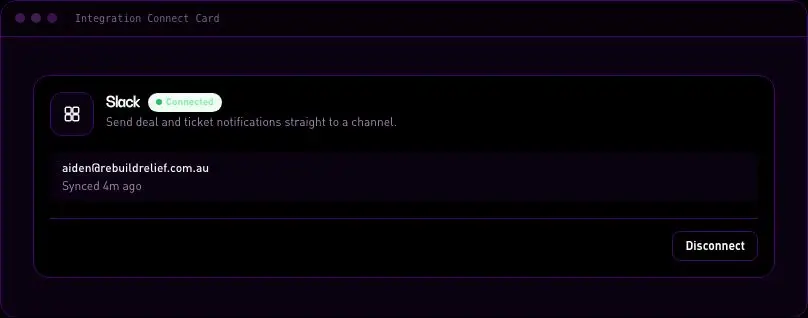
velocityx add inbox-message-card astro v1.0.2 The tile an integrations or connected-apps settings page is built from — service mark, description, and a clearly-labelled connected/disconnected state with its connect or disconnect action. Shows the linked account and last-synced time once connected.
velocityx add integration-connect-card react v1.0.1 The shared-link unfurl people already expect from iMessage, Slack and Notion — thumbnail, favicon, source and description in one clickable card, dropped into any feed or share surface.
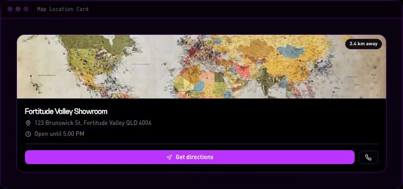
velocityx add link-preview-card react v1.0.1 A store/branch listing tile — address, today's hours, distance and a Get Directions action that deep-links to Google Maps by default. Drop in any static map image (Mapbox/Google Static Maps API or a screenshot) via a plain prop; no map SDK, no API key required to render the card itself.
velocityx add map-location-card astro v1.0.1 Image or video cover card locked to a fixed aspect ratio with a skeleton placeholder, so the cover never shifts the title or meta row as it loads — the fix for cover-card CLS in blog grids, galleries and video libraries.
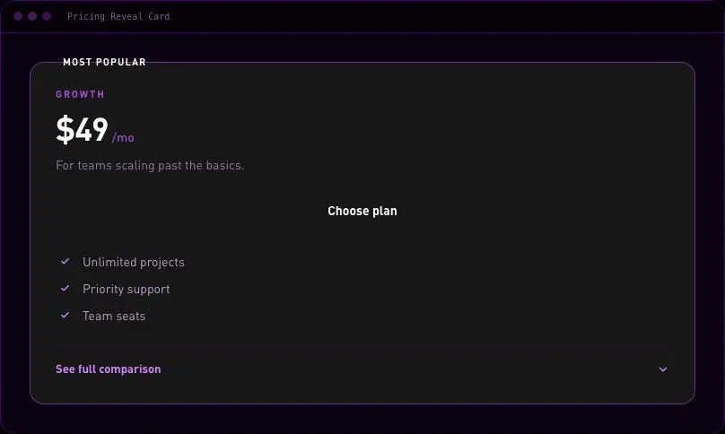
velocityx add media-cover-card react v1.0.1 Pricing tier card that expands in place into a full feature-by-feature comparison table, so shoppers can go deep on one plan without leaving the card or jumping to a separate comparison page.
velocityx add pricing-reveal-card react v1.0.1 A compact product tile built for a side-by-side comparison row — image, title, price with an optional strike-through, and a short spec list that stays readable at small widths. Lighter than a full product-detail panel, denser than a storefront grid card.
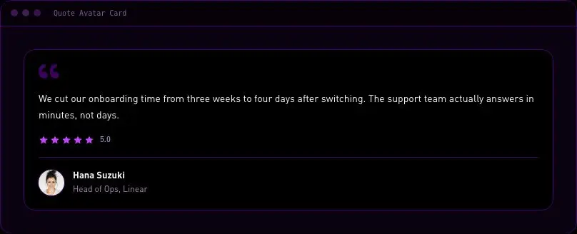
velocityx add product-spec-card astro v1.0.1 A testimonial tile sized to sit three-up in a plain grid — quote, name, role, avatar and an optional star rating that's labelled for screen readers, not colour- or icon-only. A generic card primitive rather than a section-owning marketing block.
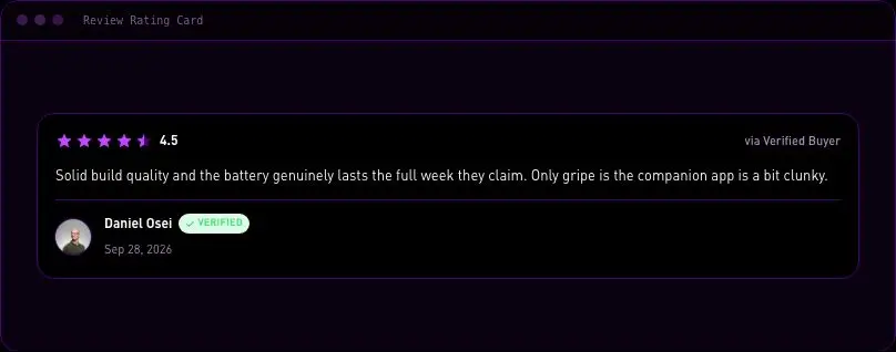
velocityx add quote-avatar-card react v1.0.1 A compact, star-first review tile for a review-wall grid or product page — rating, review text, reviewer identity and a verified-buyer marker. A single-review primitive (not a section), distinct from Marketing & Social Proof's aggregate review-card and quote-led testimonial-card.
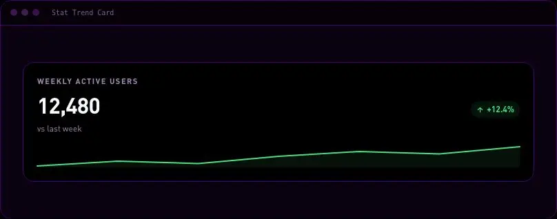
velocityx add review-rating-card react v1.0.1 A single-metric KPI tile for a dashboard grid — big number, an auto-coloured up/down delta pill, and an optional inline sparkline so the direction reads at a glance. No chart library, pure inline SVG.
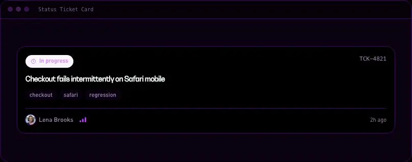
velocityx add stat-trend-card astro v1.0.1 The card shape a support queue, issue board or ops tracker is built from — status pill, title, meta row with ID/priority/updated-at, and an assignee chip with avatar fallback. Status is always labelled, never colour-only.
velocityx add status-ticket-card react v1.0.1 Compact team tile that reveals a bio and social links on hover, with the exact same reveal on keyboard focus, so the richer detail isn't mouse-only and the grid never reflows while it opens.
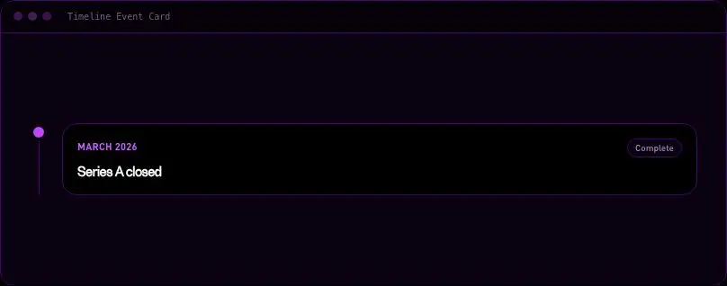
velocityx add team-hover-card react v1.0.1 A single dated entry for a vertical timeline — changelog, case history, roadmap or company milestones — with a connector node and line sized to chain into a list, a status flag (complete / current / upcoming) that's never colour-only, and a slot for the body copy.
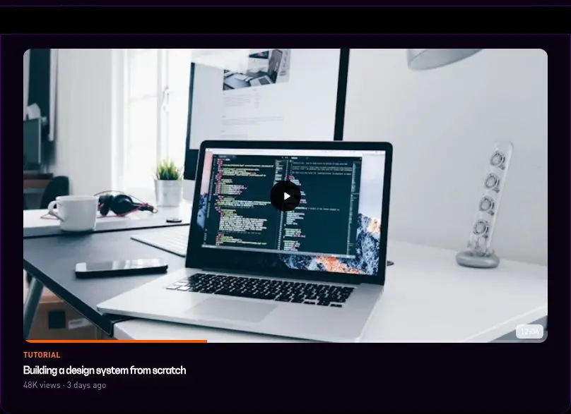
velocityx add timeline-event-card astro v1.0.1 The tile a video library, course list or media grid is built from — poster frame, duration badge, play affordance and an optional watched-progress bar. Links out to your own player route rather than embedding one, so a grid of these stays light.
velocityx add video-thumbnail-card react v1.0.1 Stat band whose numbers count up when the section scrolls into view, then settle. No runtime dependency — plain Astro plus a small inline observer. Honours prefers-reduced-motion by rendering final values immediately.
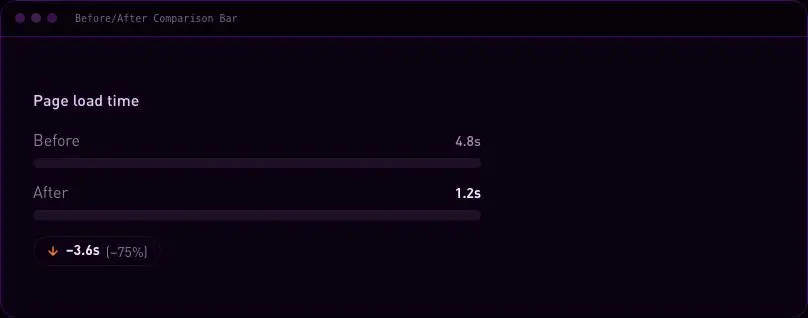
velocityx add animated-stats astro v1.0.1 Puts two numbers on one shared scale and calls out the delta — the proof-point shape for 'we cut your load time' or 'conversion rate before vs. after' case studies. Ships a screen-reader summary alongside the bars, so the comparison reads correctly even without the visual.
velocityx add before-after-bar astro v1.0.2 One headline figure sized to carry a section on its own, with a short annotation line underneath for context. Locale-safe number formatting (including compact '4.2M' notation) and a count-up that lands on the real value immediately for reduced-motion users.
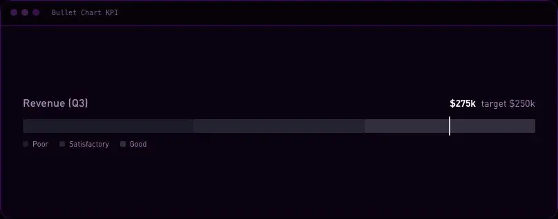
velocityx add big-number-stat astro v1.0.1 The compact way to show actual-vs-target on a scorecard row: a thin fill against a qualitative poor/satisfactory/good band, with a tick marking the target, so a whole KPI reads in the space a single number used to take. Values stay in text too, so it holds up for anyone who can't read the bar visually.
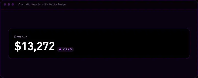
velocityx add bullet-chart-kpi astro v1.0.2 A single large figure that counts up the moment it scrolls into view, paired with a directional change badge. No chart library, no runtime dependency — locale-safe number formatting and a permanent screen-reader value so the real number is never hidden behind the animation.
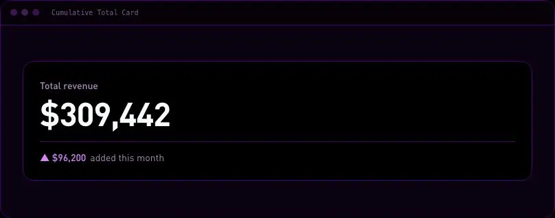
velocityx add count-up-delta-stat astro v1.0.1 A lifetime running total — total revenue, total signups, total units shipped — with the current period's own contribution called out underneath, so a reader sees where things stand and what just moved the needle in one card instead of two.
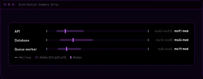
velocityx add cumulative-total-card astro v1.0.1 Stacks several datasets as one-line range tracks so min, median, max and the middle-50% spread are readable at a glance down a list — load times by route, deal size by rep, response time by week. A compact alternative to a histogram when the shape of the data matters less than where it sits.
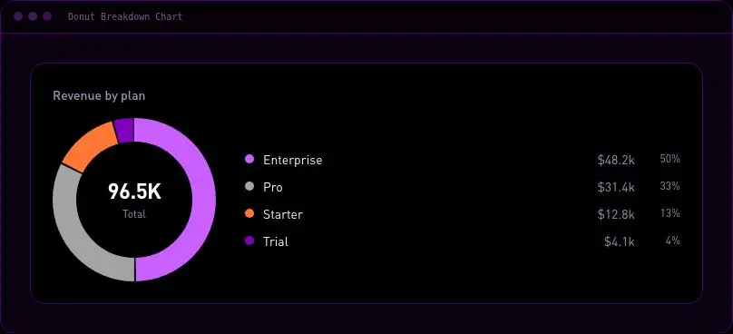
velocityx add distribution-summary-strip astro v1.0.1 Shows how a total splits across a handful of categories — revenue by plan, traffic by channel, tickets by type — as a donut with a legend and an exact-value table underneath. Every segment carries a fixed colour, a direct percentage and a legend row at once, so the breakdown reads correctly even for colourblind viewers or screen readers.
velocityx add donut-breakdown-chart astro v1.0.1 Turns a signup, checkout or sales pipeline into a descending set of stage bars, with the step-over-step conversion rate and the raw drop-off count called out next to each one — so the question 'where are we losing people' is answered on sight, not after opening a tooltip.
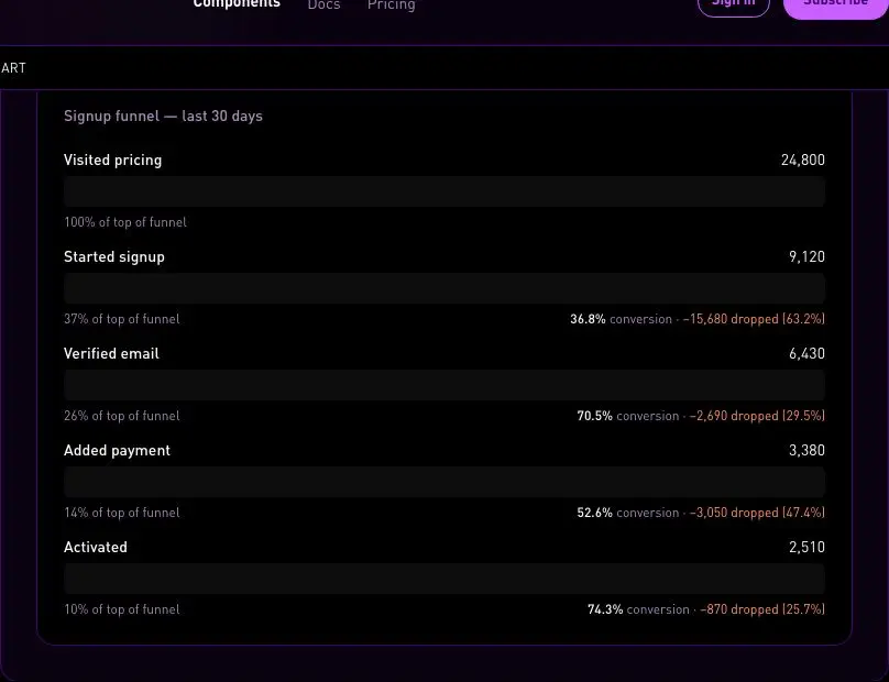
velocityx add funnel-conversion-chart astro v1.0.1 A current-vs-target meter for revenue goals, quotas and SLAs, with a labelled threshold marker on the same track so the team can see at a glance whether they're ahead or behind. Over/under is never shown by colour alone — a worded status pill and a hatch texture on the fill carry the same meaning.
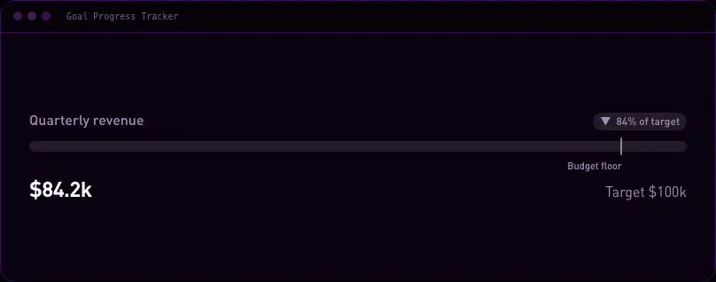
velocityx add goal-progress-tracker astro v1.0.1 A GitHub-style year grid of daily activity — commits, workouts, orders, logins, anything with one value per day — shaded by a five-step intensity legend so density reads at a glance. Scrolls inside its own container, so a full year never breaks the page layout on mobile.
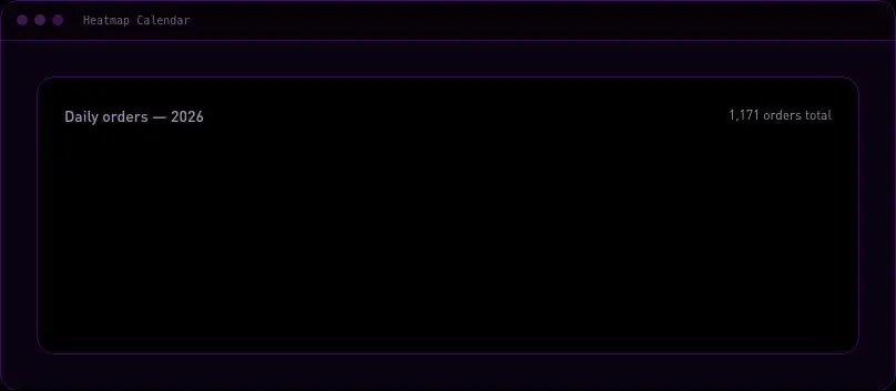
velocityx add heatmap-calendar astro v1.0.1 A ranked top-N list — top pages, top referrers, top SKUs — where bar length shows magnitude and every label and value stays fully legible outside the fill, never clipped or reversed on dark mode. Auto-sorts descending, prints the rank number on every row, and ships an exact-value table fallback for anyone who can't read the bars visually.
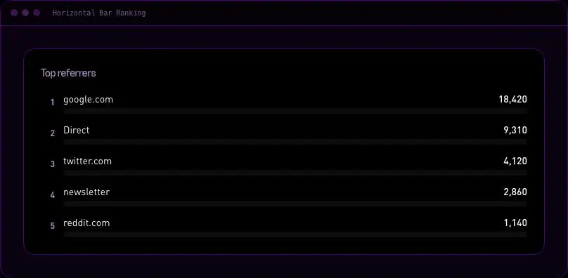
velocityx add horizontal-bar-ranking astro v1.0.1 A value paired with a compact inline trend line — the pattern for a metric row where every figure needs its recent history at a glance. Hand-rolled SVG computed from a plain number array, no chart library, with an accessible text summary so the trend is never color-only.
velocityx add inline-sparkline-stat astro v1.0.1 A shared-card row of metric tiles for a dashboard header or report summary — label, value and an optional directional delta badge per tile. Reflows to a two-column grid on mobile so nothing truncates at narrow widths.
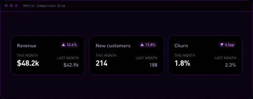
velocityx add kpi-tile-row astro v1.0.1 A grid of metric cards for a monthly or quarterly review, each one showing two periods side by side with its own delta. A per-metric goodDirection flag lets churn or latency colour correctly when down is the win, instead of every metric reading green-for-up.
velocityx add metric-comparison-grid astro v1.0.1 A single horizontal bar divided into labelled proportions — traffic sources, plan mix, budget allocation — with a legend underneath carrying the exact share for every segment. Built for the "these parts make one hundred percent" read in one horizontal sweep, with a table fallback for anyone who can't read the bar visually.
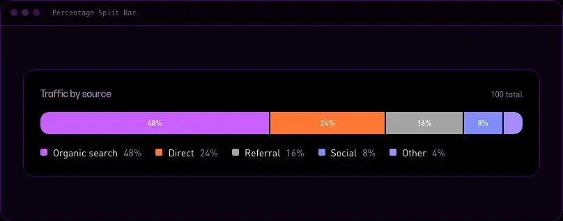
velocityx add percentage-split-bar astro v1.0.1 A metric card with a Day / Week / Month switch that re-renders its own figure and delta instantly, no reload and no chart library — lets one card do the work three separate stat tiles used to, with a real keyboard-operable tab switcher underneath.
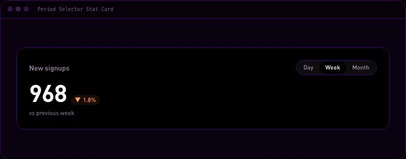
velocityx add period-selector-stat-card astro v1.0.1 A circular gauge for any 0-100 metric — profile completion, renewal rate, score cards. Reads instantly with a centre value and a labelled track, and exposes real meter semantics so screen readers announce the number, not just the shape.
velocityx add progress-ring astro v1.0.1 A ranked leaderboard — top accounts, top pages, top reps — where every row states how far it moved since the last period in plain words alongside the arrow, so a skim of the list still tells you who's climbing and who's slipping without reading a tooltip.
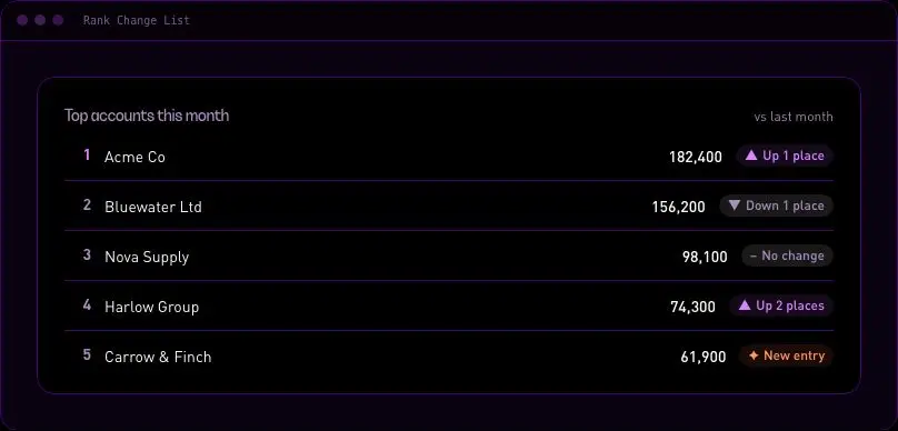
velocityx add rank-change-list astro v1.0.1 Grid of metric cards that scores each one against its own target, with a written verdict — on track, at risk, or missed — instead of colour-only pass/fail. Handles metrics where lower is the win, like churn or response time, with a single flag per card.
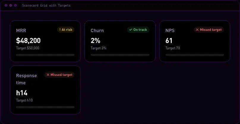
velocityx add scorecard-grid-targets astro v1.0.1 A wall of small labelled trend lines for scanning every region, SKU or account at once instead of reading one chart at a time. Each tile carries its own value, delta and line, the grid reflows to a single column on mobile, and the full set is mirrored in a table for anyone who can't read the lines visually.
velocityx add sparkline-trend-grid astro v1.0.1 A compact dashboard-cell chart that stacks two or three series over time — traffic by channel, revenue by segment, tickets by priority — so composition and total trend read together without needing a full-width chart section.
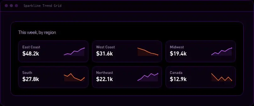
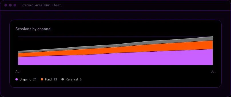
velocityx add stacked-area-mini-chart astro v1.0.1 A sequence of headline figures pinned along a dated rail, for a company-history or growth-milestones section. One flexbox rail flips from a horizontal scroller on desktop to a vertical list on mobile with a single media query, so there's no JS layout branching to get out of sync.
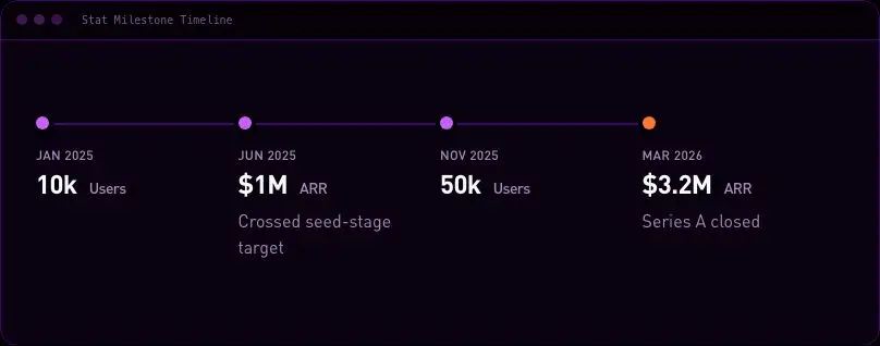
velocityx add stat-milestone-timeline astro v1.0.1 A headline metric paired with a small multi-point trend line, sized to drop straight into a dashboard grid cell — MRR, active users, response time over time. Carries first/last axis labels and an optional second comparison series (this period vs last), with a legend and hidden data table so the trend is never colour-only.
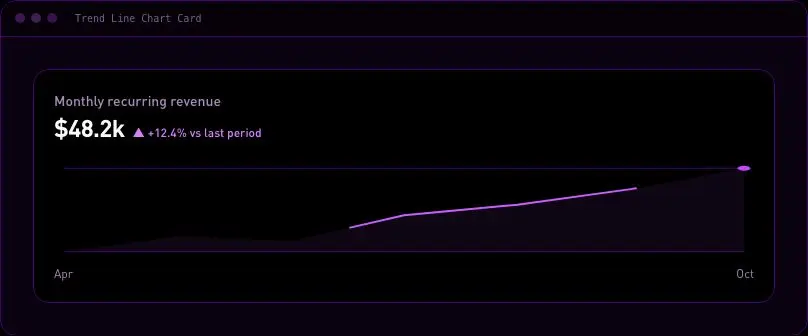
velocityx add trend-line-chart-card astro v1.0.1 Shows how a run of gains and losses builds a start total into an end total, step by step. Positive and negative steps carry their own glyph and position so the direction reads without relying on colour, with a plain-text breakdown underneath for screen readers.
velocityx add waterfall-chart astro v1.0.1 The note / tip / warning / danger callout a docs page or technical article needs repeatedly, from one component instead of four. Left accent bar + icon + label so variants read apart at a glance without relying on colour alone, built for pages that stack several of these without feeling noisy.
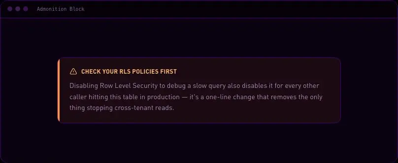
velocityx add admonition-block astro v1.0.1 The affiliate/sponsored/review-unit disclosure strip that monetised long-form content needs near the top of the piece — calm, matter-of-fact copy with an optional link to a standing disclosure policy.
velocityx add article-disclosure-banner astro v1.0.1 A lightweight 'was this helpful?' strip for the end of a post or docs page — thumbs up/down with an optional comment box that only appears after a choice is made, ending in a thank-you state. A deliberately lighter, binary take than a full satisfaction-score prompt, built to drop straight into prose with no state library.
velocityx add article-feedback-prompt astro v1.0.2 The opening block for a blog or long-form page — kicker, headline, dek, and an author/date/read-time meta row, with an optional cover image. Marked up as a proper document header with one real h1, so the rest of the article's heading order stays correct.
velocityx add article-hero astro v1.0.1 Author, date, read time, category and a last-updated stamp collapsed into one compact row you can drop anywhere a piece needs its provenance shown on its own — a reprint, an archive card, a changelog entry — without pulling in a full page header.
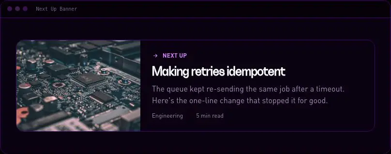
velocityx add article-meta-bar astro v1.0.1 A deliberate, feature-card-sized hand-off to the next piece worth reading at the end of an article — cover image, title and excerpt — built to feel like an editorial pick rather than a footnote link row.
velocityx add article-next-up-banner astro v1.0.1 The "in short" box at the top of a long piece — key points plus a meta strip of estimated read time, word count, difficulty level and last-updated date, so a skimmer sees the shape of the article before committing to it.
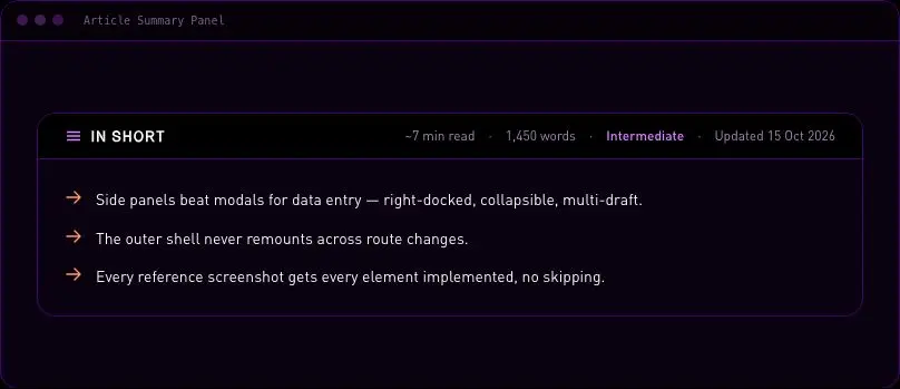
velocityx add article-summary-panel astro v1.0.1 Sticky outline for long-form pages that tracks reading position automatically — the active section highlights itself as the reader scrolls, with no scroll-handler jank. Collapses to a tap-to-open "Jump to section" list on mobile instead of eating sidebar space that isn't there.
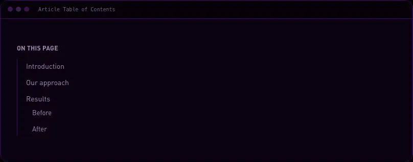
velocityx add article-toc astro v1.0.1 A first-person break-in-voice from the writer — indented, dashed-border margin note with a small avatar/initial and name, reading like a personal comment rather than an editorial callout or an enlarged quote from the body text.
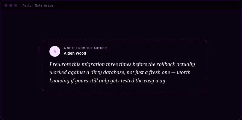
velocityx add author-note-aside astro v1.0.2 A full section break for very long pieces — ebooks, multi-part guides, long docs — so the reader feels a real page turn between chapters instead of just another heading in the scroll. Numbered kicker, title and an optional standfirst, flanked by hairline rules on both themes.
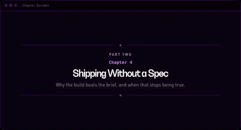
velocityx add chapter-divider astro v1.0.1 A quoted external source formatted like a real citation — quote, author, linked publication name and an optional accessed-on date — for research pieces, reviews and well-sourced articles that quote other outlets.
velocityx add citation-block astro v1.0.1 An inline defined term that reveals its definition on hover and focus with a link through to the full glossary entry, so a reader who knows the jargon never breaks stride and one who doesn't gets the answer without leaving the paragraph. Keyboard-operable and dismissible with Escape, never a bare `title` tooltip.
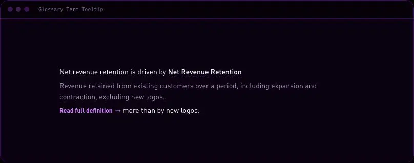
velocityx add glossary-term-tooltip astro v1.0.1 A single-question poll dropped mid-article, with real radio-button options and a result bar that appears once the reader votes. Keyboard- and screen-reader-operable out of the box; your own API call owns persisting the vote and the caller supplies the tallies back in — this never fakes a backend.
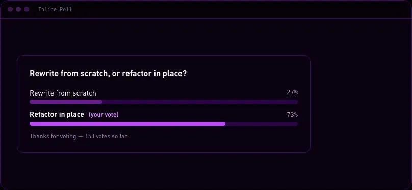
velocityx add inline-poll astro v1.0.1 A proper image block for long-form writing: real caption, optional source credit, and a click-to-enlarge view for diagrams and screenshots a narrow article column can't show at full detail. No lightbox dependency — the enlarge is a focus-trapped native dialog that closes on Escape and hands focus straight back.
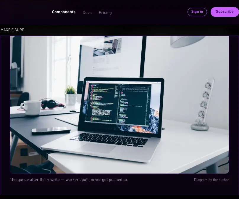
velocityx add long-form-annotated-image-figure astro v1.0.1 The end-of-article notes block for a sourced, academic-grade piece — numbered entries that each link back to the exact spot in the body that cited them, so a reader (and a screen reader) can jump to a note and jump straight back without losing their place.
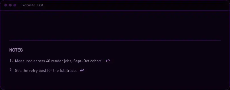
velocityx add long-form-footnote-list astro v1.0.1 Links a multi-part guide together so readers don't have to go hunting through search results to find the next instalment. Shows the series title, the reader's position ('Part 2 of 4'), and a previous/next pair that gracefully folds to one link at either end of the series.
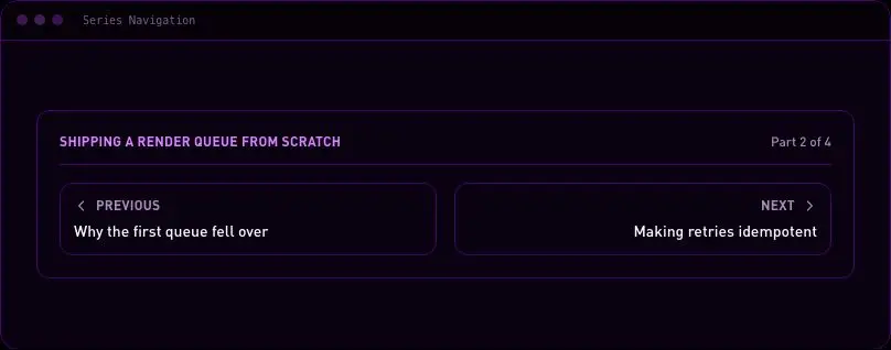
velocityx add long-form-series-navigation astro v1.0.2 Runs the explanation and the code sample it's describing side by side instead of stacking a code block under a wall of text — prose on one side, a labelled, independently scrollable code box on the other. Drops to a single column on mobile with the explanation first. No syntax-highlighter dependency to maintain or theme.
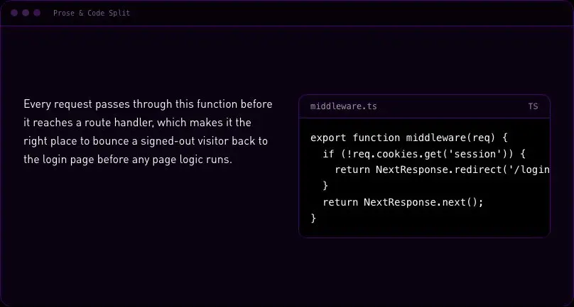
velocityx add prose-code-split astro v1.0.1 A large extracted quote that visually breaks out of the article's text column — wider, centred, oversized type, its own top/bottom rules — so a feature or essay gets a real reading-pace rest stop instead of another paragraph. Centred or left-aligned, with an optional name and role for attribution.
velocityx add pull-quote-breakout astro v1.0.1 Four long-form scannability primitives — Callout (4 variants), a Key Takeaways TL;DR box, a large PullQuote and a reading-time pill. Branded via CSS custom properties, dark-mode aware, zero motion, zero dependencies.
velocityx add readability-kit astro v1.0.1 Lets readers pick a comfortable text size and line width for a long article and remembers the choice for their next visit, instead of forcing one fixed measure on everyone. Labelled buttons and a radiogroup, never icon-only controls, and it degrades gracefully if storage is blocked.
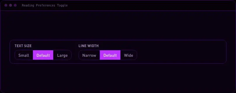
velocityx add reading-preferences-toggle astro v1.0.1 A thin fixed bar across the top of the page that fills as the reader moves through an article, giving a constant sense of how much is left. Driven entirely by IntersectionObserver thresholds rather than a scroll handler, so there's no layout thrashing on long pages.
velocityx add reading-progress astro v1.0.1 A "keep reading" strip for the end of a blog post — category, title and read time on each card, laid out as a grid on desktop and a horizontally-scrollable row on mobile instead of three full-height stacked cards. No JS, no dependencies.
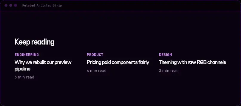
velocityx add related-articles astro v1.0.1 A share toolbar for a long-form page — X, LinkedIn, email and copy-link. Sticky in the left gutter on desktop where there's margin to spare, collapses to a horizontal bar next to the byline on mobile. Copy-link confirms via an accessible live region instead of a toast that only sighted users see.
velocityx add share-rail astro v1.0.1 An inline footnote marker that reveals its note in a popover on click, instead of sending the reader to the bottom of the page and back. Fully keyboard operable — Enter/Space to open, Escape or an outside click to close.
velocityx add sidenote astro v1.0.1 A numbered how-to walkthrough where every step gets its own anchored heading, optional code block, and optional screenshot, so a reader can bookmark a specific step or a support agent can link straight to the one that's failing instead of saying 'scroll down'.
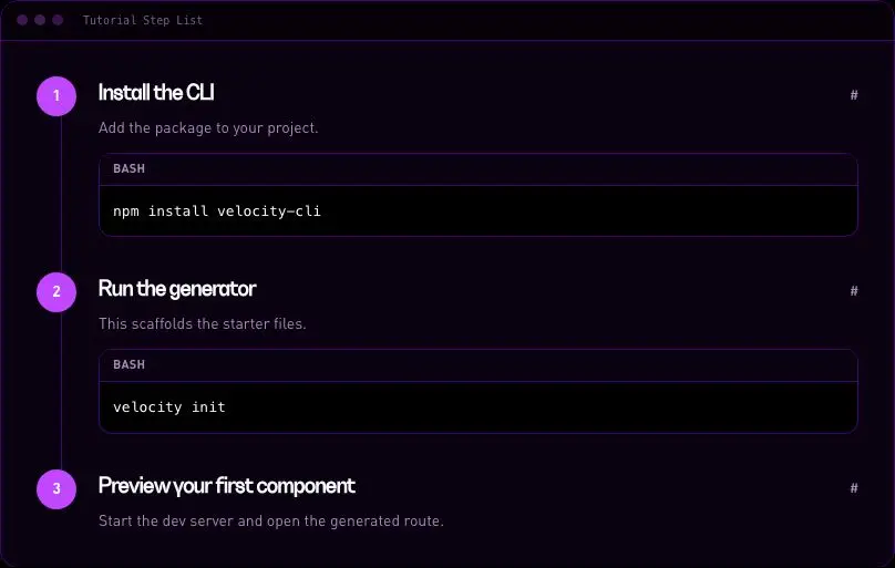
velocityx add tutorial-step-list astro v1.0.1 A persistent top-docked bar that resurfaces a cart left behind on any route, showing item count and total with Resume and Clear actions — a cross-page return nudge, not a cart panel.
velocityx add abandoned-cart-strip react v1.0.1 A bottom-docked banner that nudges mobile visitors to open or install the native app, with iOS/Android-aware copy and store links, and a dismissal that snoozes for two weeks instead of forever.
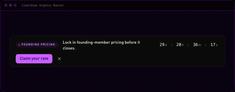
velocityx add app-install-prompt react v1.0.1 An inline deadline banner for a sale or launch window that counts down and then degrades gracefully to a plain closing message the instant it ends — never a broken negative-time state. Dismissible and remembered for the session.
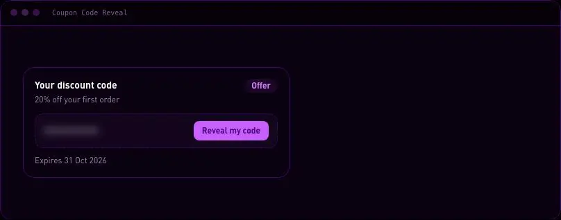
velocityx add countdown-urgency-banner react v1.0.1 A claim-to-reveal discount code card with one-tap copy and an expiry note, so the offer reads as earned rather than just printed on the page.
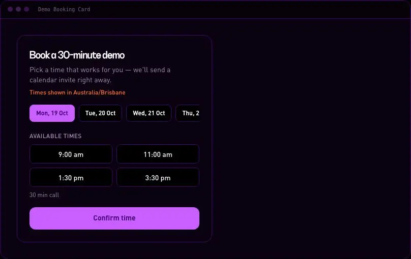
velocityx add coupon-code-reveal react v1.0.1 An inline day-and-time picker for booking a demo call, showing every slot in the visitor's own detected timezone so nobody has to do the conversion math themselves. Submits the chosen slot to any scheduling backend and ends in a confirmed state.
velocityx add demo-booking-card react v1.0.1 A top-of-page announcement strip for a sale, launch or policy notice, with one link and a close button whose dismissal is remembered across visits so it never nags a visitor who already closed it.
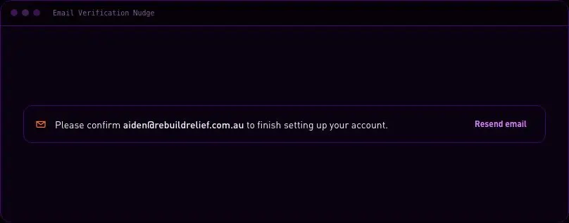
velocityx add dismissible-promo-bar react v1.0.1 A thin, dismissible reminder that an address still needs confirming, with a resend button that enforces a real cooldown instead of letting users hammer the send button.
velocityx add email-verification-nudge react v1.0.1 A last-chance discount bar that drops in from the top the moment a visitor looks ready to leave — exit-intent on desktop, fast scroll-up on mobile. Shows once per session with a cooldown, so it never nags a returning visitor.
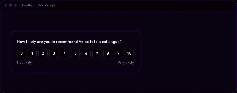
velocityx add exit-intent-offer-bar react v1.0.1 A self-contained NPS/satisfaction prompt that walks a visitor through picking a score, leaving an optional follow-up comment, and landing on a thank-you state — a complete inline feedback flow for the end of a feature, ticket, or post-purchase page, not just a bare rating control.
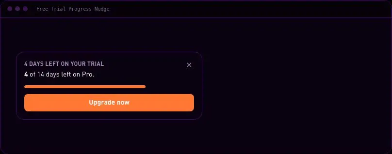
velocityx add feedback-nps-prompt react v1.0.2 A days-remaining trial card with one upgrade action, whose tone steps from calm to urgent as the account's real trial clock runs down so the nudge gets harder to ignore exactly when it should.
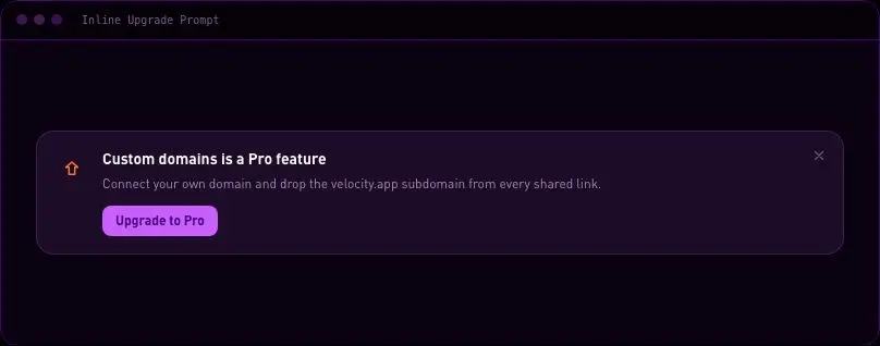
velocityx add free-trial-progress-nudge react v1.0.1 A contextual nudge toward a paid tier sized to live inside a dashboard panel, not interrupt it — no modal, no backdrop. Dismissible with the dismissal remembered per feature, keyboard-escapable, and configurable to either call an upgrade handler or link straight to billing.
velocityx add inline-upgrade-prompt react v1.0.1 Exit-intent (desktop) plus scroll-up (mobile) lead popup. Once-per-session with a cooldown, accessible, dark-mode and dismiss-friendly.
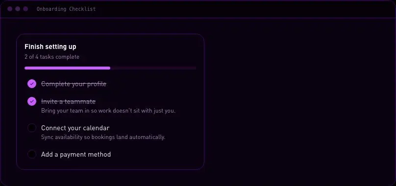
velocityx add lead-capture-popup react v1.0.3 A setup-task checklist that tracks completion with a progress bar and word count, and gets out of the way on its own once every task is done.
velocityx add onboarding-checklist react v1.0.1 A self-contained referral panel for a dashboard or account page — a copyable share link, an invite-by-email field, and a reward progress bar showing exactly how close the user is to their next unlock. Copy works without a toast library and confirms via screen-reader text, with a clipboard fallback for locked-down browsers.
velocityx add referral-invite-card react v1.0.2 A status card for a referral program already in motion — invites sent against conversions, a tiered milestone ladder, and the next reward named in plain words, not just a bar.
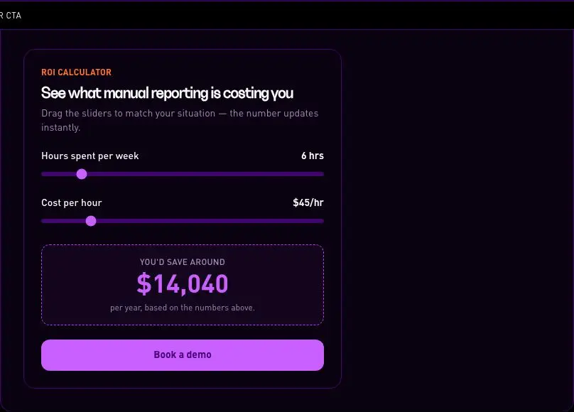
velocityx add referral-progress-tracker react v1.0.1 A two-slider ROI calculator that turns a visitor's own hours-and-cost numbers into an instant dollar figure, then hands them straight to a CTA with that figure attached — built for a pricing or landing page where the sell is personal savings, not a generic feature list.
velocityx add roi-savings-calculator-cta react v1.0.1 An honest remaining-count or demand signal for a product, seat or event listing, driven entirely by the real numbers you pass in — no manufactured countdown, so it never says 'almost gone' about something that isn't.
velocityx add scarcity-stock-indicator react v1.0.1 A share-to-unlock card that states the reward plainly and unlocks it the moment a visitor shares via WhatsApp, X, Facebook, email, native share or copy-link — no platform SDKs, just plain share URLs.
velocityx add share-incentive-card react v1.0.1 Bottom-left toast that rotates short, credible social-proof lines on an interval then stops. Pauses on hover, dismisses for the session, aria-live and safe-area aware.
velocityx add social-proof-toast react v1.0.3 Mobile and tablet bottom CTA bar that slides in past the hero, keeping the primary conversion one thumb-tap away. Dismissible and safe-area aware.
velocityx add sticky-cta-bar react v1.0.3 The blocking screen that replaces the product once a trial runs out — upgrade is the one clear action, but data export and support stay reachable so a billing moment never reads as a trap.
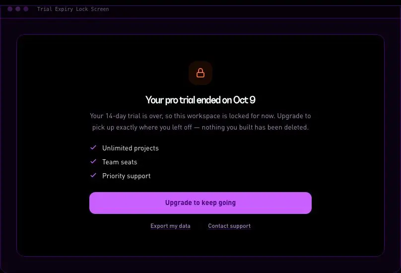
velocityx add trial-expiry-lock-screen react v1.0.1 A restrained row of security, payment, and compliance signals for a checkout or pricing page — monochrome line icons and a hairline divider instead of a cluttered wall of brand-colour badges. Ships with a built-in icon set (lock, card, shield, refresh) so it needs no image assets, and labels/icons are fully swappable.
velocityx add trust-badge-strip react v1.0.1 Shows consumption against a plan limit — seats, API calls, storage — with tone that escalates toward an upgrade action as the account gets close to its cap.
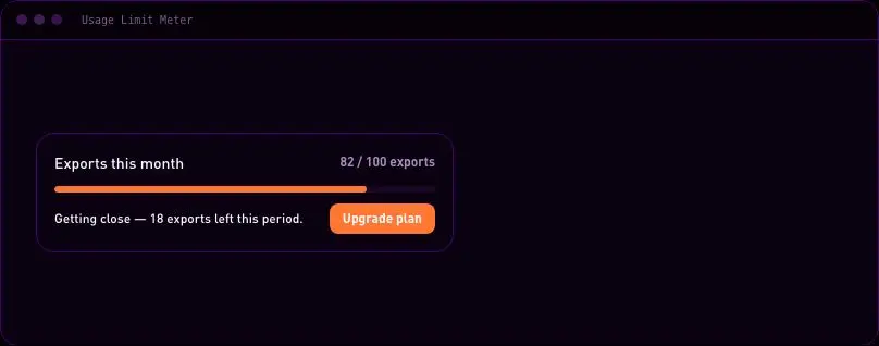
velocityx add usage-limit-meter react v1.0.1 A reassurance row of three or four benefits — icon, heading, one line — built to sit quietly under a signup or purchase button and settle last-second doubt without competing with the CTA.
velocityx add value-proposition-icon-strip react v1.0.1 An inline email-capture block for a pre-launch waitlist that leads with social proof (how many people have already joined) and tells the visitor exactly where they landed in the queue on success.
velocityx add waitlist-signup-block react v1.0.2 A query-builder for data tables — stack field/operator/value condition rows and combine them with a shared AND/OR joiner, so users compose multi-condition filters without writing a query language.
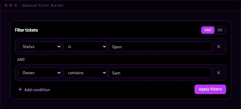
velocityx add standard-advanced-filter-builder react v1.0.1 A compliance-grade record of who did what and when, grouped under calendar-day headers with a severity tag per row and a details disclosure that reveals the structured change data only when someone needs it — built for security and admin audit trails, not a social activity stream.
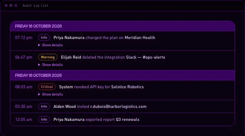
velocityx add standard-audit-log-list astro v1.0.2 Checkbox row selection for a data table with a correctly indeterminate select-all, a live selected count, and a contextual action bar that appears only once something is selected, so bulk edit, export, or delete never need a separate mode.
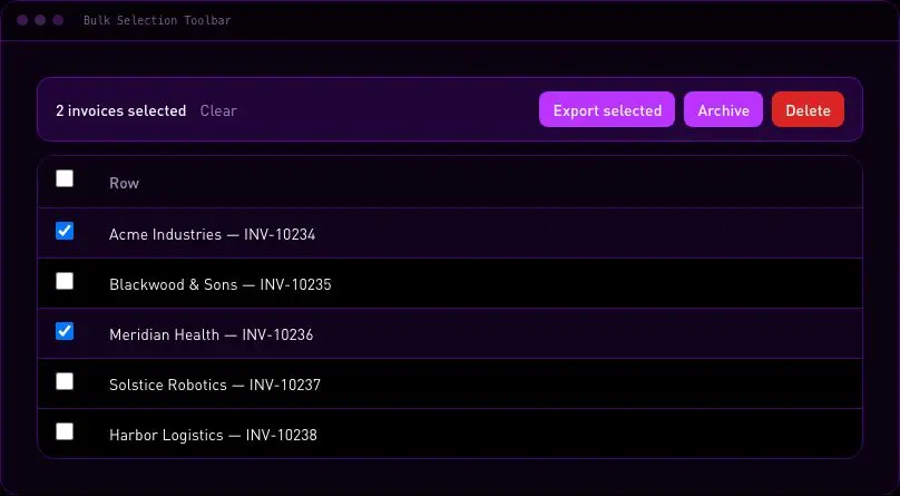
velocityx add standard-bulk-selection-toolbar react v1.0.1 Turns a truncated table cell into a focus-trapped popover showing the full value with a one-click copy button, so long IDs, JSON blobs or notes never need their own column width.
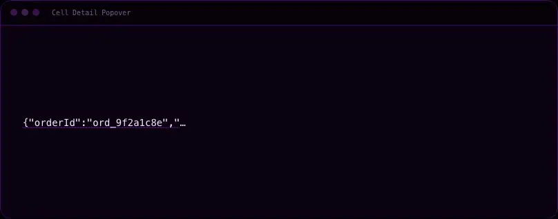
velocityx add standard-cell-detail-popover react v1.0.1 A settings popover for showing or hiding table columns, with the chosen layout remembered between visits so people don't have to rebuild their view every time they come back.
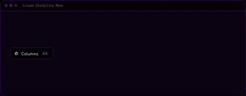
velocityx add standard-column-visibility-menu react v1.0.1 Shows when a dataset was last updated in plain words, flags it as stale past a threshold you set, and exposes a Refresh action — so a dashboard never leaves a viewer guessing whether the numbers on screen are current.
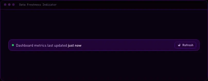
velocityx add standard-data-freshness-indicator astro v1.0.1 Shimmering placeholder rows sized to match the real table's columns, so a data grid has zero layout shift the moment live rows arrive.
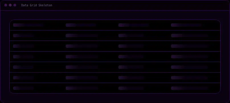
velocityx add standard-data-grid-skeleton astro v1.0.1 Semantic record details in stacked or two-column layouts with optional field hints and empty-value text.
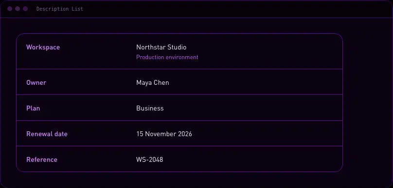
velocityx add standard-description-list astro v1.0.0 An icon, headline, short explanation and a primary action for the moment a table or list has nothing in it — so empty is a prompt, not a dead end.
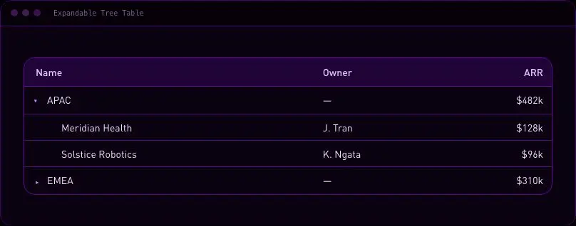
velocityx add standard-empty-state-block astro v1.0.2 A data table for hierarchical records — folders, org charts, category trees — where any row can expand to reveal its children in place, indentation and a disclosure arrow showing depth without leaving the spreadsheet-like layout.
velocityx add standard-expandable-tree-table react v1.0.1 A single export button that turns into a determinate progress bar while the job runs, then resolves into a download link or an inline retryable error — so long exports never leave users staring at a frozen button.
velocityx add standard-export-button-with-progress react v1.0.1 Active filters shown as removable chips with a clear-all action, wrapping to extra rows instead of scrolling off so long filter sets stay scannable.
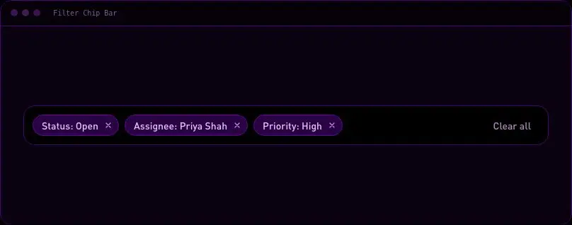
velocityx add standard-filter-chip-bar react v1.0.2 A data table whose rows collapse into named groups, each with its own subtotal row and a grand total footer — the spreadsheet-pivot view buyers expect for cohort, region, or category reporting without a pivot-table library.
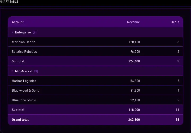
velocityx add standard-grouped-summary-table react v1.0.1 Responsive SVG histogram for numeric arrays with configurable bins, accessible summary, labelled counts, and no chart dependency.
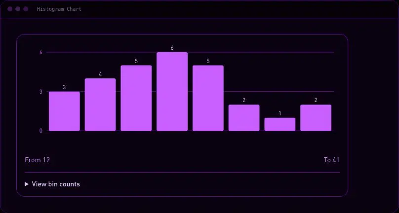
velocityx add standard-histogram-chart astro v1.0.0 Lets people map columns from an uploaded file onto your destination fields, with a sample value per column and clear wording for anything left unmapped or assigned twice — so an import gets caught before it runs, not after it fails.
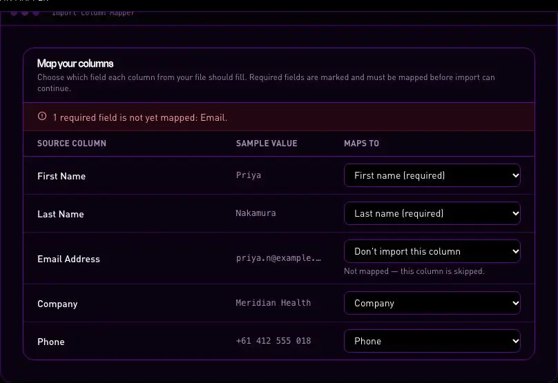
velocityx add standard-import-column-mapper react v1.0.2 Edit a data grid in place: click or press Enter to open a cell, Tab commits the change and advances to the next field, Escape cancels back to the original value. No drawer or dialog round trip for quick corrections.
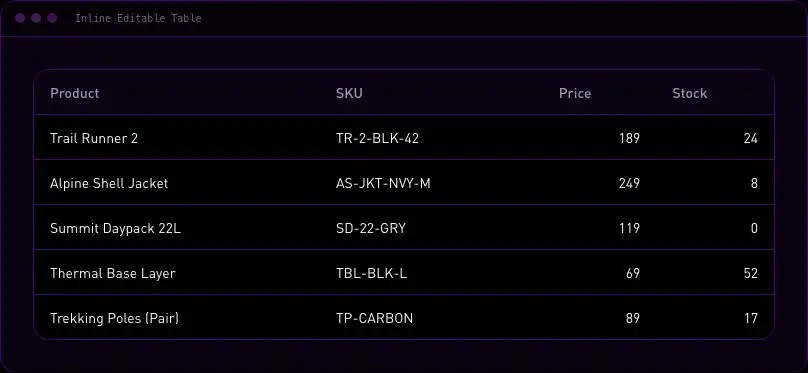
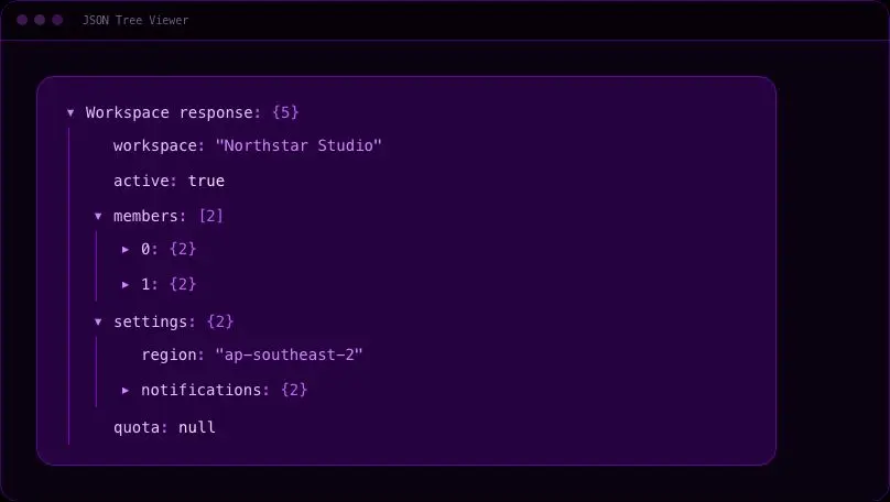
velocityx add standard-inline-editable-table react v1.0.1 Expandable nested JSON inspector with type-aware values, configurable initial depth, and native keyboard-operable disclosure buttons.
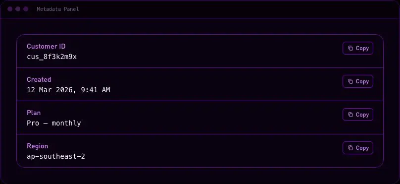
velocityx add standard-json-tree-viewer react v1.0.0 Label/value rows for an object detail view — IDs, keys, timestamps — with a one-click copy button on every value so nobody has to select-and-drag.
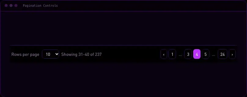
velocityx add standard-metadata-panel react v1.0.2 Page navigation with a rows-per-page selector and a live "showing X-Y of Z" readout, so users can jump pages or change density without losing their place.
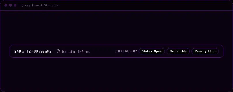
velocityx add standard-pagination-controls react v1.0.2 The strip above a results table that states what the query returned — row count, how long it took, and the filters applied — so people trust the table below without re-reading every filter chip themselves.
velocityx add standard-query-result-stats-bar astro v1.0.1 The top banner of any single-record page — title, identifiers with one-click copy, a status pill, and the primary and secondary actions for that record — so every detail view opens with the same orientation cues instead of a bespoke header each time.
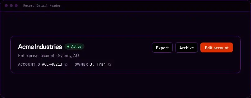
velocityx add standard-record-detail-header react v1.0.1 A drag-to-reorder list of rows with a full keyboard equivalent — Alt+Up/Down or move buttons — and a spoken position announcement on every move, for ordered data like pipeline stages or priority queues.
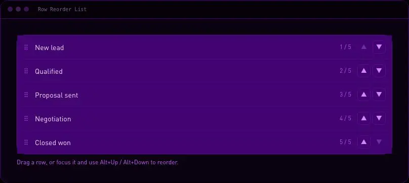
velocityx add standard-row-reorder-list react v1.0.1 A dropdown for switching between named table views, with save-current-as-new and rename-in-place built in, so users can keep several filtered/sorted layouts ready without rebuilding them each time.
velocityx add standard-saved-views-selector react v1.0.2 Click any column header to sort a dataset ascending or descending, with a sticky header and its own horizontal scroll so wide tables never widen the page on mobile.
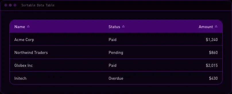
velocityx add standard-sortable-data-table react v1.0.2 Shows exactly what changed between two blocks of text — side-by-side or as a single unified list — with every added or removed line carrying a glyph and a screen-reader label so the change is readable without relying on colour.
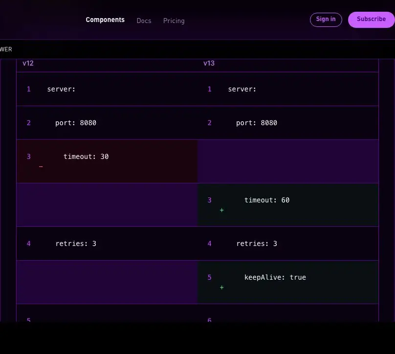
velocityx add standard-text-diff-viewer astro v1.0.2 In-page section links that highlight themselves as the reader scrolls, so a long docs or landing page always shows where you are without you having to hunt for it. Tracks visibility with IntersectionObserver, never a scroll handler, so it costs nothing on long pages.
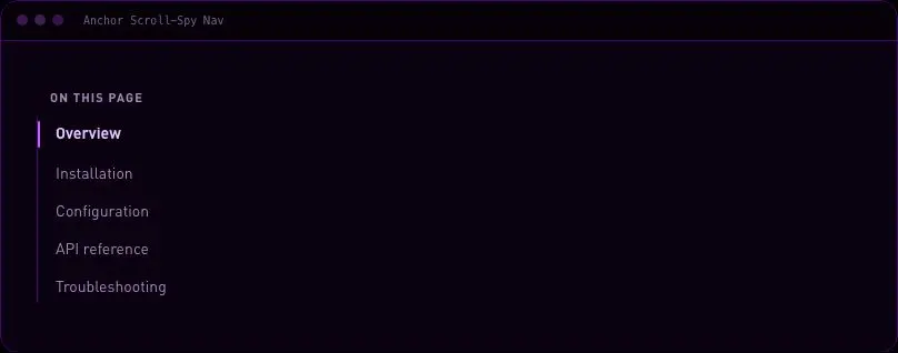
velocityx add standard-anchor-scroll-spy-nav react v1.0.1 A 'waffle' product switcher popover for suites that have grown past one nav bar into several standalone apps — a grid of icon tiles for every section, the current one marked, fully arrow-key navigable and closes cleanly on outside click or route change.
velocityx add standard-app-launcher-grid react v1.0.1 Header for a drill-down screen: a real back link to the parent (not a history hack), the page title and optional subtitle, and an overflow menu for secondary actions that don't need a permanent button.
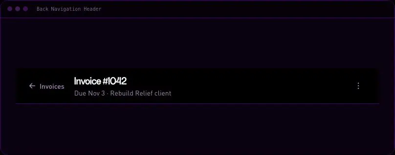
velocityx add standard-back-navigation-header react v1.0.1 Wayfinding trail for deep page hierarchies that collapses middle segments behind an ellipsis on narrow screens, keeping the root and current page always visible, with the current page shown as text rather than a dead link.
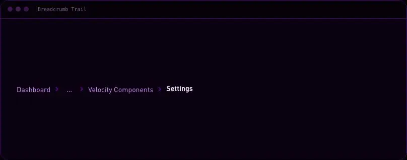
velocityx add standard-breadcrumb-trail react v1.0.1 A ⌘K search trigger that opens a fuzzy-filterable command list for jumping anywhere or running any action without leaving the keyboard. Hand-rolled matching, no dependency, with full focus trapping and keyboard selection out of the box.
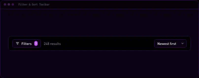
velocityx add standard-command-palette react v1.0.1 The control bar that sits above any listing: result count, a sort dropdown, a List/Grid view switch, and a filter trigger badged with how many filters are active. This sets the state; pair it with a filter-chip row if you also need to show which filters are applied.
velocityx add standard-filter-sort-toolbar react v1.0.1 A small floating pill for jumping between named sections on long single-page layouts — stays a quiet handle near the top of the page and expands into labelled section dots once the reader scrolls past the hero.
velocityx add standard-floating-section-dock react v1.0.2 The load-more boundary at the end of a list: an invisible IntersectionObserver trigger pages in more results automatically, backed by a real "Load more" button for anyone whose browser blocks it, and a calm end-of-list message once there's nothing left to fetch.
velocityx add standard-infinite-scroll-sentinel-nav react v1.0.1 A reference panel listing every keyboard shortcut your app supports, grouped by area, opened with a single press of ? like Linear and GitHub — without hijacking the key while someone's typing in a search box or form field.
velocityx add standard-keyboard-shortcuts-help react v1.0.1 A language-and-region picker for footers and headers that shows the current selection as plain text, never a flag — flags map to countries, not languages, and break down the moment one language spans several regions.
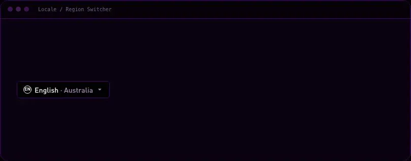
velocityx add standard-locale-region-switcher react v1.0.1 Fixed, app-style bottom navigation for 3-5 top-level destinations on phone-width screens. Clear active state, icon + label pairing, and safe-area padding so it never collides with an iOS home indicator or Android gesture bar.
velocityx add standard-mobile-bottom-tab-bar react v1.0.1 A sidebar nav list that surfaces live counts next to each item — unread messages, open tickets, new records — so people know where to look first without opening every section. Counts past 99 collapse to a clean "99+" instead of blowing out the rail, and empty counts hide the badge entirely.
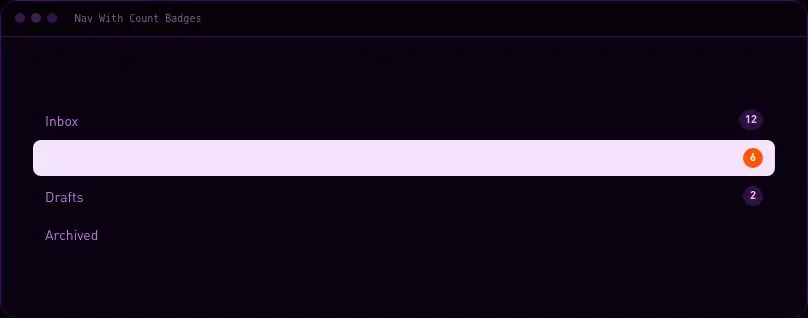
velocityx add standard-nav-count-badges react v1.0.1 A breadcrumb-shaped strip that doubles as a flow tracker for checkout, onboarding or any multi-page sequence — completed steps are real links back, the current step is clearly marked, and steps still ahead are genuinely non-interactive until the user gets there. Compact enough for a header bar, where a full step-circle wizard would be overkill.
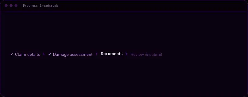
velocityx add standard-progress-breadcrumb react v1.0.1 A small "Recent" trigger that drops a quick-switch list of the records someone just had open — the last deal, ticket or document — so jumping back takes one click instead of a search. Full keyboard support (arrow keys, Enter, Home/End) with no search box at all, which keeps it a fast recall tool rather than a command launcher.
velocityx add standard-recent-items-switcher react v1.0.1 End-of-page block of onward destinations — a heading and a responsive grid of fully-clickable cards, each with a short description and a hover arrow. Static markup, no client JS, built for "related articles" and "keep exploring" footers.
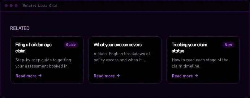
velocityx add standard-related-links-grid astro v1.0.1 A horizontally scrollable tab strip for pages with more sections than fit a narrow screen — edge fade masks hint there's more to scroll, the active tab scrolls itself into view on selection, and the overflow stays contained inside the strip instead of widening the page.
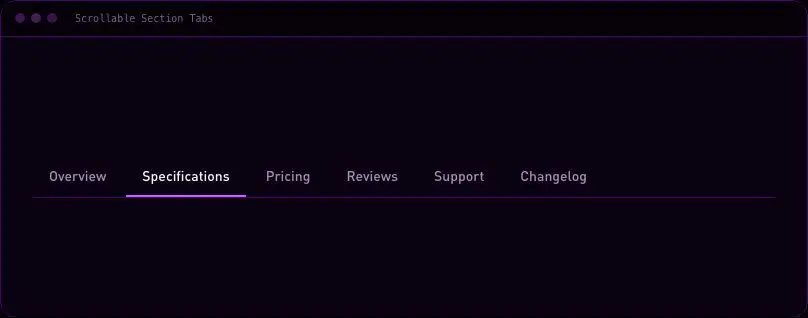
velocityx add standard-scrollable-section-tabs react v1.0.2 A compact 2-4 option switch for flipping between view modes — List/Grid, Day/Week/Month — rendered as one track with a sliding selection pill instead of separate buttons. Fully arrow-key operable as a radio group.
velocityx add standard-segmented-control react v1.0.1 App sidebar organised into collapsible sections, each holding its own links. Highlights the active route, auto-opens the section a deep link lands in, and keeps every other section's open/closed state exactly as the user left it across route changes.
velocityx add standard-sidebar-nav react v1.0.1 The "skip to content" links keyboard and screen reader users expect as the first stop on a page, styled to match your brand instead of showing as an unstyled browser-default blue link when focused.
velocityx add standard-skip-links astro v1.0.1 A compact clickable dot/pill position indicator for slide decks, galleries and onboarding screens — the active dot stretches into a pill, every dot is a real button with roving keyboard focus, and position is announced to screen readers rather than shown by colour alone.
velocityx add standard-step-dots-nav react v1.0.1 A horizontal section rail that docks under the header once the page scrolls past it, highlights whichever section is actually in view, and shows how far through the whole page the reader has gotten with a thin fill — built for long docs and product pages where a sidebar doesn't fit.
velocityx add standard-sticky-section-progress-nav react v1.0.2 Horizontal tab bar with a sliding underline that glides to the active tab's measured position, full Left/Right/Home/End keyboard navigation, and panels wired with correct ARIA tabs semantics.
velocityx add standard-tab-bar-underline react v1.0.1 Hierarchical documentation or file navigation with ARIA tree semantics, branch disclosure, current-page state, and arrow-key focus movement.
velocityx add standard-tree-navigation react v1.0.0 A narrow left-docked rail of icon-only buttons for app shells — hover or focus reveals a tooltip naming each destination, and a solid active bar shows where you are without spending any horizontal space on labels.
velocityx add standard-vertical-icon-rail react v1.0.1 Numbered step navigation for checkout, onboarding and signup flows, with clear complete/current/upcoming states and a filling connector line. Collapses to a compact 'Step N of M' progress bar on phone so nothing truncates.
velocityx add standard-wizard-stepper-nav react v1.0.1 Confirmation dialog with least-destructive initial focus, async action support, Escape cancellation, and focus restoration.
velocityx add standard-alert-dialog react v1.0.1 A small marker pinned to a live element to flag something new or needing attention, that opens its explanation on click rather than hover. The badge itself persists until the user explicitly dismisses it, so a flagged field stays flagged until actually read, not until the cursor happens to pass over it.
velocityx add standard-anchored-callout-badge react v1.0.2 Mobile data-entry sheet with three drag snap points — peek, half and full — so the page stays reachable behind it instead of a full-screen takeover. Drag by pointer or step by keyboard, Escape to close, focus returns to the trigger.
velocityx add standard-bottom-sheet-snap-points react v1.0.2 One step of a product walkthrough — a spotlight ring that tracks a live target element, a callout card with a step counter and Next/Back/Skip, fully keyboard operable. Escape always exits the whole tour, never just the current step, so a new user is never stuck in a walkthrough with no way out.
velocityx add standard-coach-mark-tour-step react v1.0.1 Right-click and long-press menu for an item, grouped into labelled sections with arrow-key and typeahead navigation, disabled items, and automatic edge flipping so it never opens off-screen.
velocityx add standard-context-menu react v1.0.2 Two-month calendar in a popover for picking a start/end range, with one-click presets for today, last 7/30 days, and this/last month.
velocityx add standard-date-range-popover react v1.0.2 Stops an accidental delete click by keeping the destructive action disabled until the person types the exact resource name back, with full keyboard and screen-reader support.
velocityx add standard-destructive-confirm-dialog react v1.0.2 Action menu button with arrow and typeahead navigation, disabled items, separators, Escape close, and focus return.
velocityx add standard-dropdown-action-menu react v1.0.1 Rich preview panel that appears when someone hovers or focuses a link or avatar — a bio card, a profile summary, an account snapshot — with open and close delays so it never flashes on a passing pointer.
velocityx add standard-hover-card react v1.0.2 Full-width, page-level notice bar for outages, trial warnings or a system-wide success confirmation — distinct from a boxed in-content alert card. Pairs an icon with a text severity label so meaning never rides on colour alone, carries an optional action button alongside dismiss, and announces through an aria-live region set to polite for info/success and assertive for warning/error.
velocityx add standard-inline-notification-banner react v1.0.1 Full-screen viewer for a photo grid — click any thumbnail to open on that frame, then step through with arrows, keyboard or a swipe while a counter and dot rail always show exactly where in the set you are.
velocityx add standard-lightbox-gallery-overlay react v1.0.2 Bottom sheet for narrowing a product or search list — grouped checkbox filters with a live 'show N results' count on the apply button, so shoppers see the effect of a selection before it's committed, and reset undoes the whole draft in one tap.
velocityx add standard-mobile-filter-sheet react v1.0.2 Accessible native modal dialog with inert background, Escape close, backdrop dismissal, and focus restoration.
velocityx add standard-modal-dialog react v1.0.1 A setup or checkout dialog that carries its own wizard flow instead of forcing a custom build: progress rail, Back/Next footer, per-step validation gating, and focus moved to the new step's heading on every change, with focus returned to the trigger on close.
velocityx add standard-multi-step-dialog react v1.0.2 Dropdown menu whose items open child menus of their own, any number of levels deep — a 'File > Export > Image' pattern. Up/Down traverse the current level, Right opens a submenu and focuses its first item, Left closes it and returns focus to the parent item, Escape closes every open level at once. Each submenu flips to the opposite side when it would render off the viewport edge.
velocityx add standard-nested-submenu-menu react v1.0.2 Click-triggered panel for small interactive content — a quick filter, a mini form, a colour picker — with an arrow that stays pinned to the trigger, flips side when it would run off the viewport, and traps focus inside while it's open.
velocityx add standard-popover-arrow react v1.0.2 Type-to-filter dropdown for picking one item out of a long list from a toolbar or filter bar, with full keyboard selection and typeahead highlighting.
velocityx add standard-searchable-select-menu react v1.0.2 Bottom-anchored share sheet with social and messaging targets plus a copy-link action, built on plain outbound URLs so it needs no platform SDK or API key.
velocityx add standard-share-sheet-overlay react v1.0.2 A right-docked sheet for viewing one record's several facets — details, activity, files — as tabs instead of one long scroll, with arrow-key tab navigation and the open tab remembered across close and reopen. A content organiser for an existing record, not a drafting surface like the slide-over drawer.
velocityx add standard-sheet-with-tabs react v1.0.2 Right-docked drawer for data entry that keeps the page behind it visible and interruptible, with a collapse-to-dock tab so a draft stays open while the user keeps working elsewhere. Trapped focus, locked scroll, Escape to close, focus returns to the trigger.
velocityx add standard-slide-over-drawer react v1.0.2 One-click primary action fused to a dropdown of its close relatives — 'Save' plus a chevron for 'Save as draft' or 'Save and publish' — so the common path stays a single tap while the variants are a keystroke away, with each half independently announced to assistive tech.
velocityx add standard-split-button-menu react v1.0.2 Lets a sheet open another sheet on top of itself for a drill-down flow — edit a customer, open their billing history, open one invoice — with every parent layer still visibly behind the newest one and a back path that unwinds exactly one step at a time.
velocityx add standard-stacked-sheet-layers react v1.0.1 App-wide notification queue triggered from a hook anywhere in the tree: caps how many toasts show at once, holds the rest in a queue, pauses auto-dismiss on hover or focus, and separates urgent from routine variants into the correct screen-reader announcement channel.
velocityx add standard-toast-stack react v1.0.1 Hover and focus-triggered hint for icon buttons and truncated labels that waits a beat before appearing, repositions itself away from viewport edges, and is reachable and dismissible from the keyboard — unlike the native `title` attribute it replaces.
velocityx add standard-tooltip react v1.0.1 A one-at-a-time bar for an action already taken — delete, archive, send — with a visible countdown and an Undo button that stays keyboard-reachable the whole window. Hovering or focusing it pauses the clock. Distinct from the toast queue: this holds exactly one reversible action, not a stream of notices.
velocityx add standard-undo-snackbar react v1.0.1